
I think about navigation all the time—it's my job—but here's a surprise for you: you do too. You just don' t realize it.
Quite often it's:
"I'm confused by these directions."
"That sign doesn't make sense."
"I don't know where to go next."
"Where do I stand to order?"
"Who can help me?"
"How do I get out of here?!!"
These thoughts likely run through your head daily, whether you're sitting at your computer or out getting coffee. Each issue could be fixed with better navigation.
The same can be said of your website navigation. Poor navigation leaves you lost, angry and frustrated. This leads to many, many lost opportunities for your business online.
Does your website navigation succeed? Let's dive in and find out.
My, how navigation has evolved
Website design continually evolves. What worked yesterday often doesn't work today.
Once upon a time, pages were crammed with links. A full navigation bar across the top, sometimes two, and more links down the left side of the page. You had no shortage of options. But having an organized user flow wasn't at the top of anyone's minds.
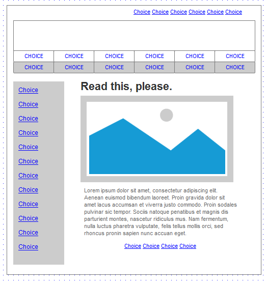
Too Many Choices - Most Websites, 2010
Today, simplicity and user flow are vital—largely because users prefer mobile devices for their browsing. It's 51.2 percent more popular than desktop, in fact. Relaunches and re-brands and algorithm updates happen daily—and you can be certain that all of it is based on creating a more favorable, more efficient user experience (UX).
After all, better UX means better traffic for your website.
That traffic depends on your navigation.
What is website navigation?
A website’s navigation system is like a road map to all the different areas and information contained within the website.
Using a consistent navigation scheme from page-to-page helps the website visitor learn your website navigation system.
Includes:
- Global Navigation: The main list of categories or pages you can choose from, visible on every page.
- Ancillary Navigation: A secondary grouping of lesser important links, usually set at the top of each page.
- Footer Navigation: The grouping at the bottom of your page, often a complete category listing and some administrative links.
- Menu: A unique grouping of links, often by category, attached to the Global Navigation.
- Text Links: Navigation prompts placed within body copy.
Together these form the roadmap that allows a user to travel through your website. Comfortably. At their own speed. Without obstacles or detours.
Keep it simple, Stella
At the very least, your navigation should not stand in the way of your customer finding what she wants. Unfortunately, you—like most website owners—may wish to show the user the whole ham and put everything up front in fear of something wonderful being left out.
What you think you need:

Look… it's a mighty Menu-saurus! Too many menu options create clutter and confusion. Cognitive overload! It flies in the face of what your customer wants and needs from a positive user experience.
What your customer really wants:
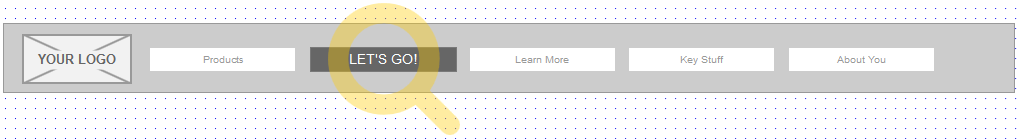
When choosing your priority menu items, it's best to stick to seven choices or fewer. The Rule of Seven has been generally accepted as the maximum amount of choices the human brain can handle in one session.
So, boil it down to several well-chosen, main categories for your customer. Your other topics can be placed in secondary positions or within body copy. Prioritizing your information is a key step in creating a healthy user experience.
Make smarter labels
The best website navigations don’t force the visitor to think. That's why you need to avoid clever, unique or confusing labels. Stick with simple and descriptive navigation link names that make the most sense.
Here are some examples of simple, spot-on navigation labels:


Give users a clear sign of what they'll see on your website. They'll spend less time searching and more time browsing through your products and services.
You are here?!
I love those great maps at the shopping mall—except when I have to hunt to find out where I am to start things out. Give your users a visible navigation system that offers cues to where they are in the website.
This is especially important for those who drop into your site through organic search and not through the home page. Use categorical links—called breadcrumbs—below your main navigation that shows the user where they are and how they can move up through the category. It's a vital part of proper navigation because it provides good context to your information.
Grade your website navigation
Now let's see where your website is at. Go through the following statements and measure where your website navigation works and where it needs to be upgraded. A good nav should meet all the criteria.
- Seven or fewer menu items: Narrow down your main navigation to 7 or fewer items. Give the user a fighting chance to find what they're there for.
- Simple labeling: Can your navigation be understood and acted upon by a 7th grader? That should be your comprehension goal.
- Breadcrumbs: Do you use some type of location reminder within your website? It's important to know both where to go and how to get back.
- Consistent placement: Do you feature the same global navigation throughout the site? It's important for users to feel a consistency of messaging and structure.
- Three clicks or less: Can users find the information they came to read in three clicks or less? It's a benchmark you should strive for.
- Mouse free browsing: Mobile users can't use mouseover or hover-state functions, so dropdowns and other callouts that rely on mouse activity must go.
- Alternatives: Give users a secondary way of getting around, like an onsite search tool or footer menu. Not everyone works the same way.
Conclusion: Five Takeaways
Here's a summary of what we just learned:
- Website navigation is one of the most influential aspects of a website's success.
- Mobile browsing has become the preferred choice of users, so your website should adjust accordingly.
- Keep your main options minimal—7 or fewer—to avoid brain overload.
- Simple navigation labels help a user find what they need quickly and easily.
- It's vitally important to make users aware of where they are in the website, and how to get to your home page.
Got UX?
As I said earlier, we eat, sleep, and breathe User Experience here. Let Liquid help you maximize how your website presents itself and turn visitors into customers. Drop us a line!