
The state within an application or website that doesn’t contain any data is called an empty state, and it’s something that’s easy to overlook.
Empty states are very common for new users who are unfamiliar with an application or website, so it’s important to design for what happens when someone isn’t yet a power user.
Designing empty states answers questions like:
- What does someone see the first time they sign in?
- What happens when there are no items in a shopping cart?
- What if there are no open support tickets?
- How does someone populate a list?
- What should my first task look like?
A good practice for someone with zero items in their list is to make a suggestion on where to start.
Instead of a message saying, “There’s nothing here!” — or worse, a space left blank (or worse yet, an error message)— indicate what should happen to populate that space.
Some ideas to design for empty states:
- A message indicating that this is where your things will be shown.
- A button prompting someone to start making a thing.
- A guided walkthrough on how to accomplish doing an initial thing.
- A way to get help or support if there is no thing listed where there should be a thing listed.
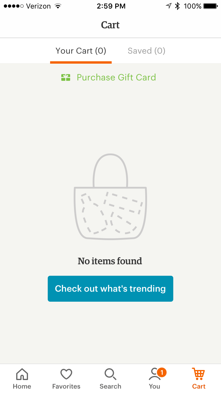
Etsy prompts me to check out what’s trending when there’s nothing in my cart.
For inspiration, check out emptystat.es for a curated collection of empty states from popular websites and apps.