
If you work in a marketing, analytics or related field, chances are you’re inundated with data, and part of your job requires you to review or break down that data in order to make business decisions or recommendations. Chances are also likely that your company is using Google Analytics to track web, campaign and conversion activity, and perhaps you or your coworkers regularly access default and custom reports that Google Analytics offers in order to make those important business decisions. While these kinds of reports can be useful to answer questions and offer insights, they are still somewhat limited in the analytics that can be provided. This is where Google Data Studio comes in.
What is Google Data Studio?
Google Data Studio is a free, easy-to-learn, online data visualization tool that can take your Google Analytics data (as well as data from a multitude of other sources) and convert it into interactive dashboard reports. When created with the right balance of interactivity and user-friendliness, a Google Data Studio dashboard will allow you to quickly dive into the data to identify problems, opportunities, trends and to develop actionable insights
I’d like to share with you a few simple, but powerful tips in Google Data Studio dashboard design that will make you look like a dashboard expert. So, let’s get started!
3 Tips for Google Data Studio Dashboard Design
1. Be User-Friendly: Place Important “Drop-down” Filters at the Top of the Report
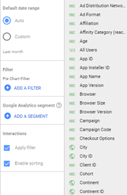
I know that this first tip may seem a bit obvious, but remember—you are designing this dashboard not for yourself, but for users who may be using a dashboard for the first time. In order to maximize a dashboard’s potential to provide a user with new insights, the dashboard must be designed to give the user many easily accessible options to dig into and analyze the data. One of the best, most user-friendly means of doing that is to provide a comprehensive list of drop-down filters near the top of the report, before your charts and graphs. An example would be something like this:
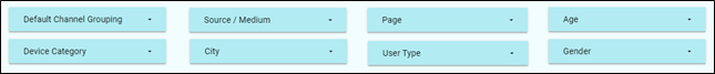
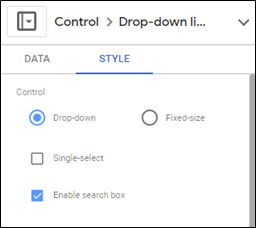
Drop-Down Filters Setup Tip: Most of these drop-down filters have a limited list from which to choose, but there can be some instances in which a list contains 50, 100, or even more choices. The “Page” drop-down example listed above would be such an example, as it refers to and lists all of a website’s pages. The best workaround to dealing with this volume of results is to first go into the “Edit” mode of the dashboard, click directly on the “Page” drop-down filter, and then click on the “Style” selection tab that will appear to the right of the dashboard. Select “Enable search box,” and you will now be able to enter a search term in that drop-down filter. This feature addition will help dashboard users more easily find the exact page or pages they’re looking for.
2. Make Every Chart an Interactive Filter
One of the easiest ways to make your dashboard more dynamic is to make your charts filters themselves! What that means is that you would have the ability to simply click on various categories within a chart in order to drill down further.
For instance, suppose you were interested in knowing how many female users on mobile devices from Philadelphia visited your company’s website in the past month. Referring to the three charts listed below, you could click (in any order) “Philadelphia,” “Female” and “Mobile” in each chart to quickly find your answer. (Note that the number of users in the “City” chart and the “Device Breakdown” charts are the same.)
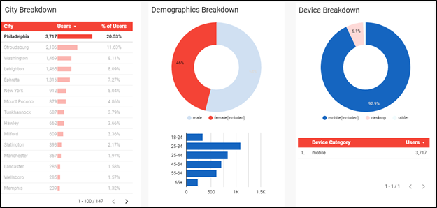
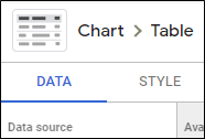
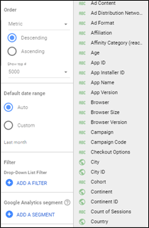
Chart Filtering Setup Tip: Doing this is very easy. Click on the chart while in the “Edit” mode, then click on the “Data” selection tab that will appear to the right of the dashboard.
Scroll down to the end, and there you will find, under “Interactions,” an option to “Apply filter.”
Simply check that box, and—congratulations—your chart is now a filter!
3. See How Your Events Interact with the Rest of Your Dashboard
Virtually all businesses using Google Analytics set up several events so they can track a variety of revenue (e.g., a purchase) and non-revenue (e.g., form submissions, pdf downloads, sharing a blog post, etc.) conversions. Google Analytics events are currently set up via an event Category-Action-Label hierarchy. With Google Data Studio, we can take advantage of this hierarchy and create drop-down filters of Event Actions and Event Labels, enabling you to drill down and either isolate or group these actions and labels together.
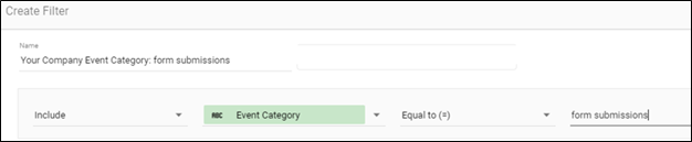
Event Data Chart Setup Tip: Once you have correctly configured your Event Action and Event Label drop-down filters, the key last step is to click on each drop-down while in the “Edit” mode, click on the “Data” selection tab of the panel, scroll down to the end, and there, under “Filter,” you will need to click on “Add a Filter.”
You will then be taken to a screen where you would then implement the logic to identify the Event Category associated with your related Actions and Labels.
You will need to create another filter using the same logic, only this time you will need to select “Event Action” instead of “Event Category.” Do this for every Event Category and Event Action for which you want to create drop-down filters or charts. You can then combine them with the Google Data Studio category choices of “Event Category,” “Event Action,” “Event Label,” and even “Unique Events” to get the results you are looking for. A good way to understand how the logic works is that if you have your “Event Category” and “Event Action” filters in place and you choose “Event Label” as your Google Data Studio category, the results will only be the metrics that are populated in that particular event label. Similarly, with the same filters in place, choosing the “Event Action” category will then result in seeing the metrics that are populated in the event action.
Once those filters are in place, you will see your Event Action and Label drop-down filters virtually come to life, with dynamic data suddenly filling your chart!
In addition, if the event chart is also made to be a filter, then whatever drop-down combination you choose for this event will then give you valuable insights in other parts of the dashboard! For instance, the chart below shows the performance of one selected type of form, the “general contact form.” Not only will you be able to see the daily performance of this event, but you can then look at the rest of the report and glean further information regarding the user type, where they came from, device preference, how they arrived, etc.
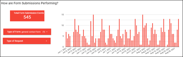
We know in this example that there were 515 users that were responsible for the 545 general contact form submission events, and 62.5% (322) of these were new users, averaging 6.64 pages per session.

If you’re interested in drilling down even further (thanks to the fact that you made this chart capable of acting as a filter), you could then click on one of the bars of the chart to see the overall web activity for a single day.
Enhance Your Career by Learning More About Google Data Studio
Google Data Studio is an incredible data visualization tool that is easy to learn. Given that Google Analytics is arguably the most popular web analytics tool used by businesses, I would strongly recommend that you leverage this tool. Even if you don’t use it now, there’s a good chance you’ll need to be familiar with it in the future. Once you do become more knowledgeable about Google Data Studio (there are plenty of free and paid-for ways to learn it), be sure to incorporate my three tips, as I believe that these will help to make you look like an expert in dashboard design!
If you are a new or even more experienced dashboard designer, I hope you found these tips to be helpful. If you’d like to learn more about what Google Data Studio has to offer, feel free to contact us here at Liquid to see how we can help you to better understand your customers and achieve your goals.