
Designing paragraphs for the web might feel a little overwhelming if you want to give your visitors a good reading experience. Thankfully, there are a few simple rules of thumb to keep your type on track.
Break up blocks of text.
Nothing makes you want to leave a web page more than landing somewhere and seeing a massive, intimidating wall of words. There’s a time and a place to read a book, and chances are, it’s not on a marketing-focused web page.
The biggest change you can make to any body of text is to break it apart — put it into consumable, digestible chunks.
Of course, the most preferable way to deliver a message is to shorten it. It’s not always an easy task to communicate in fewer words, but you have to find a more concise way to express your point if you want to keep readers’ attention.
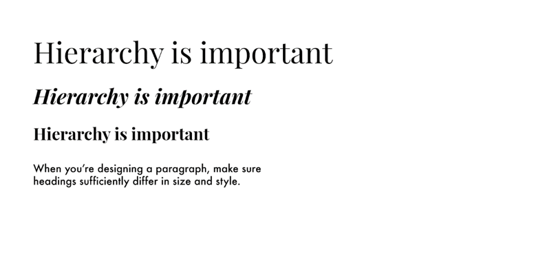
Embrace hierarchy.
Setting headings in a noticeably different size and weight goes a long way in defining the hierarchy of your page. It should be easy for readers to pick out different thoughts and ideas.
Since people scan bodies of text to find what they’re looking for, make it as easy as possible to spot — and read — headlines and separations of thought. That means each level of heading should be noticeably different in size, weight, or style than other levels.
Select a typeface designed for body copy.
When selecting a typeface for body copy, choose something with low stroke contrast — that means, generally, a typeface that uses a consistent weight, rather than something that has both wide and narrow strokes.
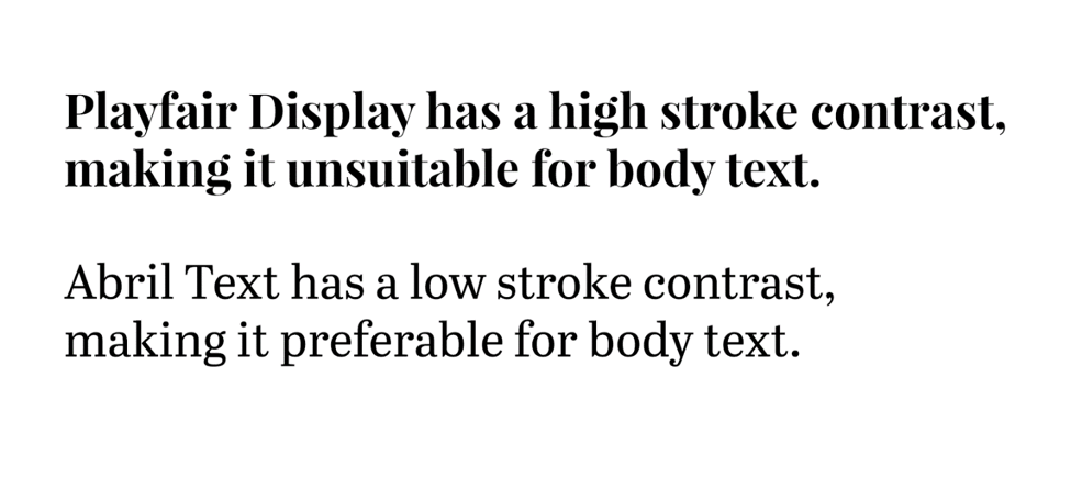
When there’s a lot of text — particularly at small sizes — it’s easier to read type that doesn’t have a ton of variance in stroke weight. The narrow bits can look a little washed out and difficult to read at small sizes.
Reduce line height.
Remember in school when you used to type papers and the teacher would ask you to double-space your paragraphs? They asked you to do that so they could leave notes between the lines, but on the web, lots of space between lines of text is not a very good technique for readability.
It might be tempting to “air out” blocks of text by adding leading (or line-height if you speak CSS), but doing so makes your paragraphs more difficult to read in reality. When you use excessive line height, it’s slightly more difficult to determine which line comes next.
A CSS line-height value of 1.5 or less is a good rule of thumb.
Use a reasonable number of characters per line.
It’s often tempting to fill an entire container with text — or maybe even a bad habit you’ve picked up without knowing it. In reality, though, it’s best to use between 45 and 75 characters per line. This way, your eyes don’t get lost or tired while you’re reading body text.
I like to use what Tachyons CSS calls “measures” to set widths of body text containers.
If you’ve adjusted the widths of your paragraphs but they still feel a little narrow, you might want to increase the size of your body text. This will take up more visual space while still using the same number of characters per line.
More reading
Check out Typewolf’s Flawless Typography Checklist course for more insight on how to master typography for the web.