

What is Visual Hierarchy?
The internet is crowded, like a deli at lunchtime. Everyone’s hungry for something, but no one wants to waste time figuring out where to look or what to order. If your content isn’t clearly structured, it’s easy to get passed over.
Users don’t typically read every word on a webpage, they scan, picking up on structure, headlines, and anything that stands out. Design quietly shapes that experience, deciding what gets noticed, what gets skipped, and how the story unfolds.
That’s what visual hierarchy in UX design does. It acts like a silent narrator, guiding users through content without saying a word. Using tools like size, spacing, color, and layout, it suggests where to start, what matters most, and what comes next. At its best, visual hierarchy turns complex information into tender, bite-sized servings, making it easier to absorb, reducing cognitive load, and helping people stay focused.
A strong hierarchy is shown to lead to lower bounce rates, higher engagement, better conversions, and stronger SEO. When content is easier to consume, it performs better with both users and search engines. For UX designers, it’s one of the most effective ways to improve clarity, storytelling, and overall functionality of any layout.
Let’s talk about some of the top elements found within visual hierarchy.
8 Core Principles of Visual Hierarchy in UX Design
Whether you're structuring a landing page, a product flow, or a full digital experience, here are some key principles designers leverage to create effective hierarchy.
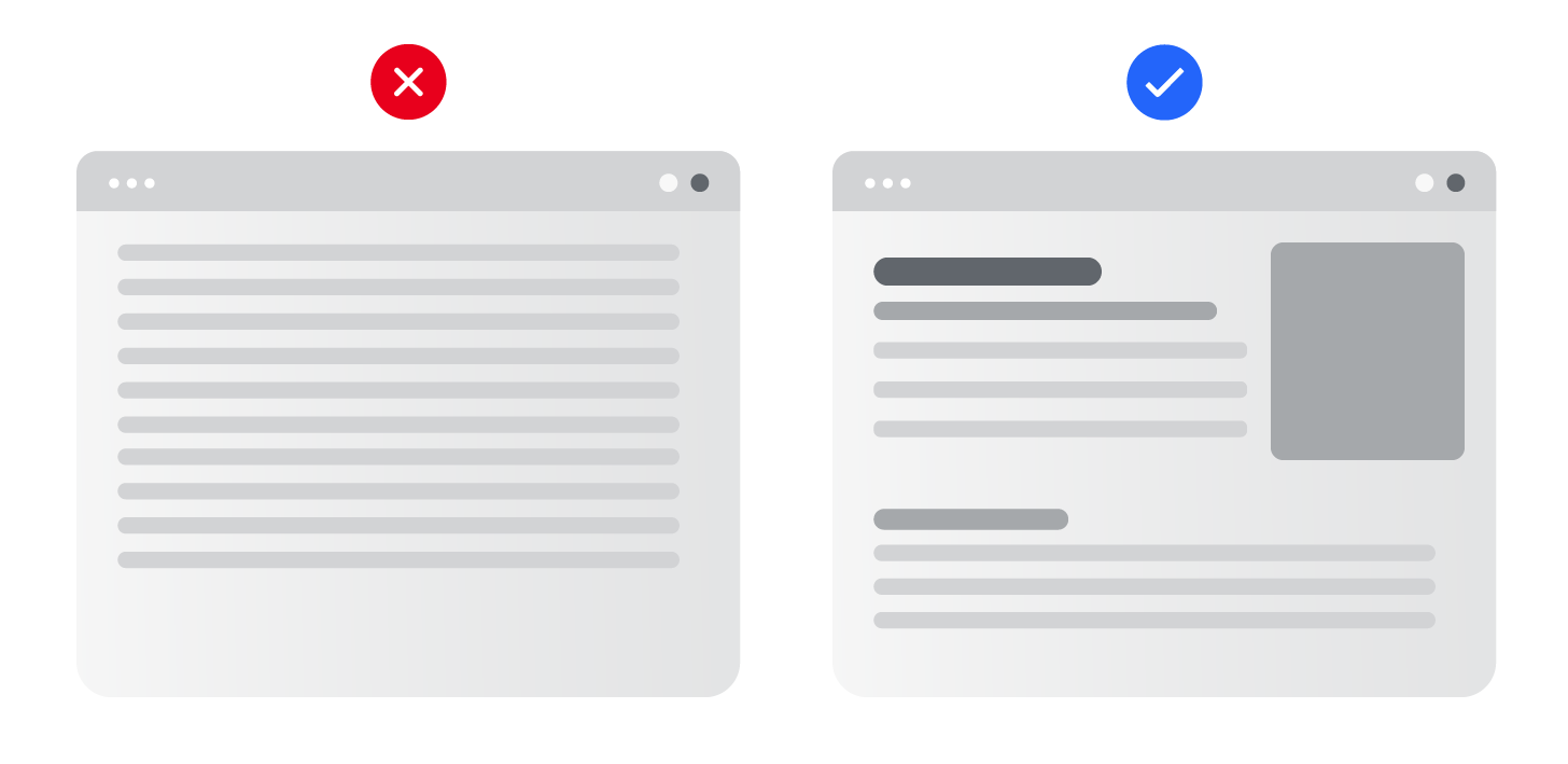
1. Size and Scale
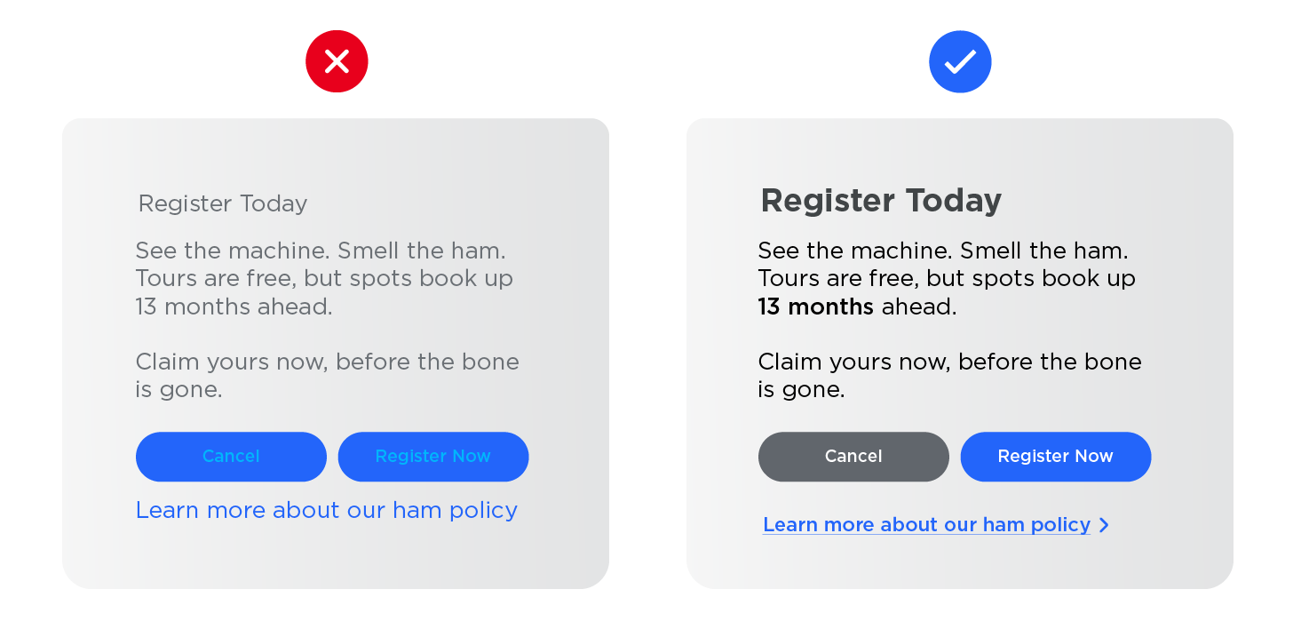
Bigger elements grab more attention. Use scale to signal importance. Headlines, CTAs, and key visuals should lead the eye. When two elements are the same size, they compete, making it harder for users to know where to focus. Smart sizing is more powerful than you think.
2. Color and Contrast
Bold contrasts and accent colors help guide the eye and emphasize what matters. Make sure color choices meet accessibility standards so everyone can navigate your content clearly. I use the Web Accessibility in Mind website to make sure all my type colors are compliant.
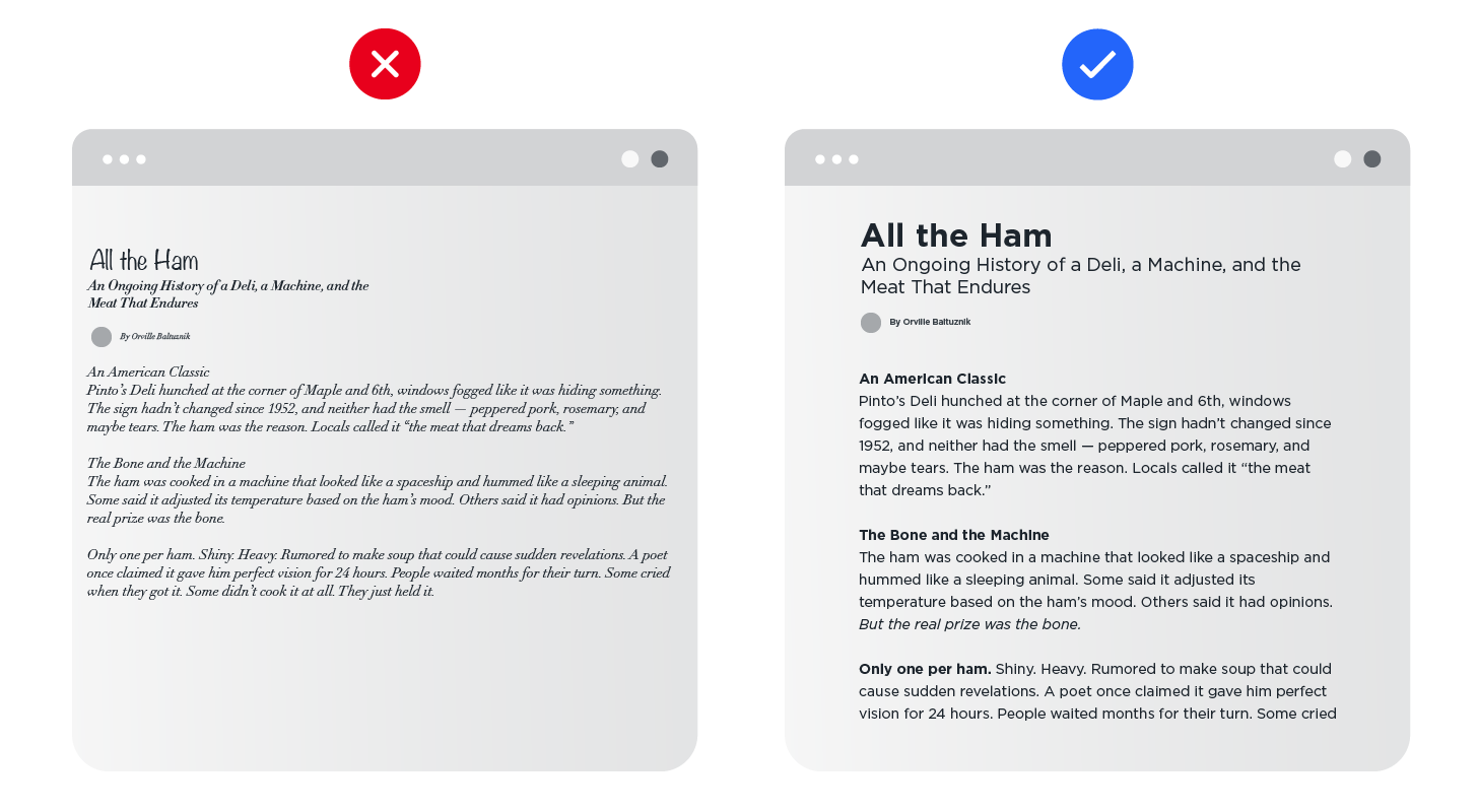
3. Typography
Typography is the prized ham of your layout. It’s one of the most critical pieces in establishing importance. Using varying weights and sizes help differentiate sections and what to read first. Keep styling simple and consistent so the structure is easy to follow and information is more likely to be retained. Keep the number of different typefaces to one or two.
4. Spacing
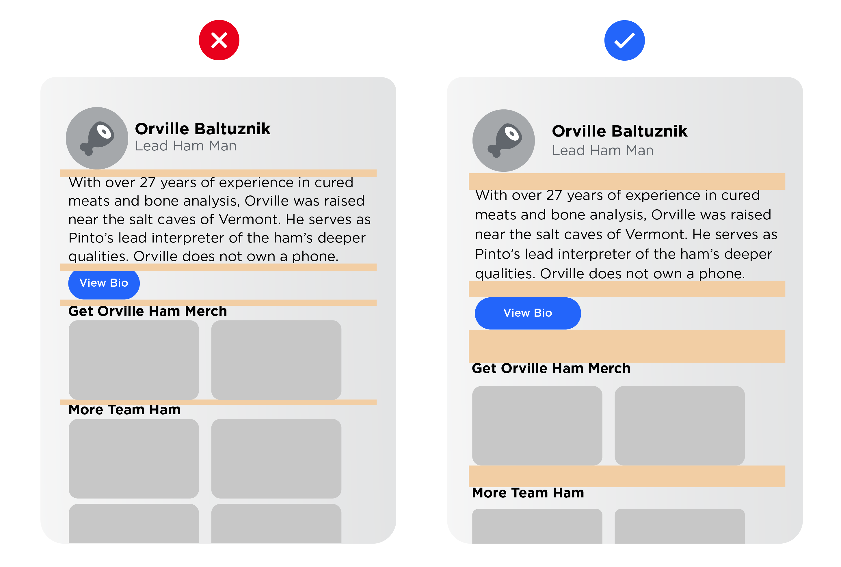
Adequate horizontal and vertical spacing between sections reduces clutter and improves comprehension. Whitespace is one of the most overlooked elements in visual hierarchy and also one of the most essential.
Without it, websites can feel crammed and chaotic, often triggering choice paralysis rather than encouraging action. We’ve all landed on a page that tries to squeeze everything "above the fold" like it's still printed on newsprint.
Use space to direct the narrative. It helps guide attention, shape meaning, and move users through content with intention.
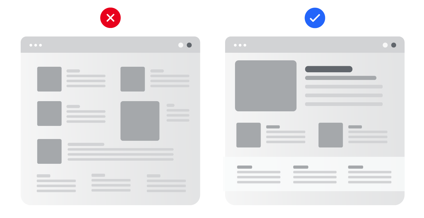
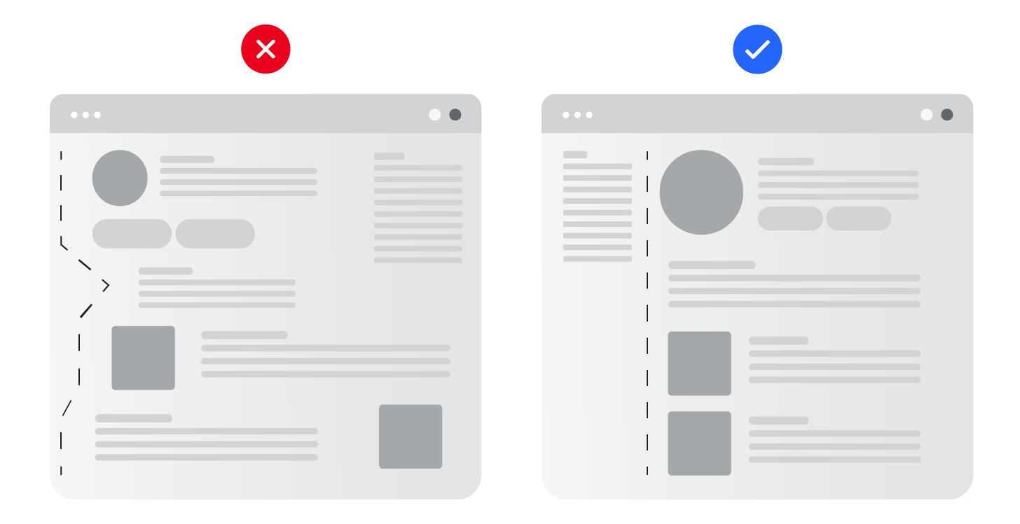
5. Alignment and Proximity
Group related content together and align elements to establish visual order. Using a consistent grid system creates structure and balance, making the entire experience feel more intuitive. When things are structured consistently, users don’t have to work as hard to make sense of what they’re looking at. For example, because people read left to right, left-aligned content is easier to process.
6. Layout and Composition
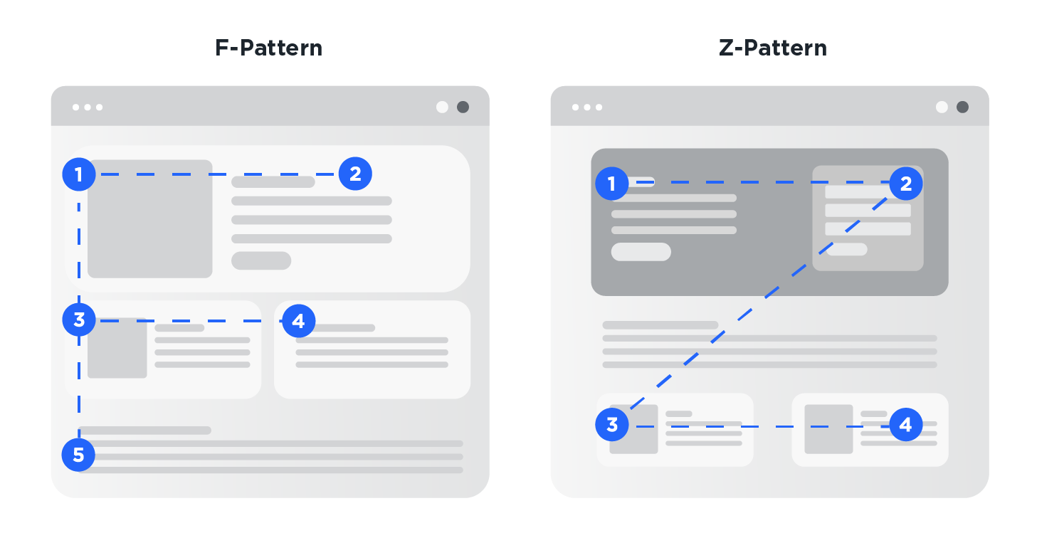
Structure content based on how users naturally scan. The F-pattern reflects how people read text-heavy pages, starting at the top and scanning down the left side with occasional horizontal sweeps. The Z-pattern suits simpler layouts, where the eye moves from top left to right, then diagonally down to the bottom left and across again. This works well for landing pages or hero sections.
7. Imagery and Iconography
Images help set tone and draw attention but should be used only when relevant to the copy. Icons are a great way to establish structure and can make common actions or functionalities instantly recognizable, like a magnifying glass for search. They enhance scanability, reduce the need for extra text, and support accessibility when paired with clear labels or alt text.
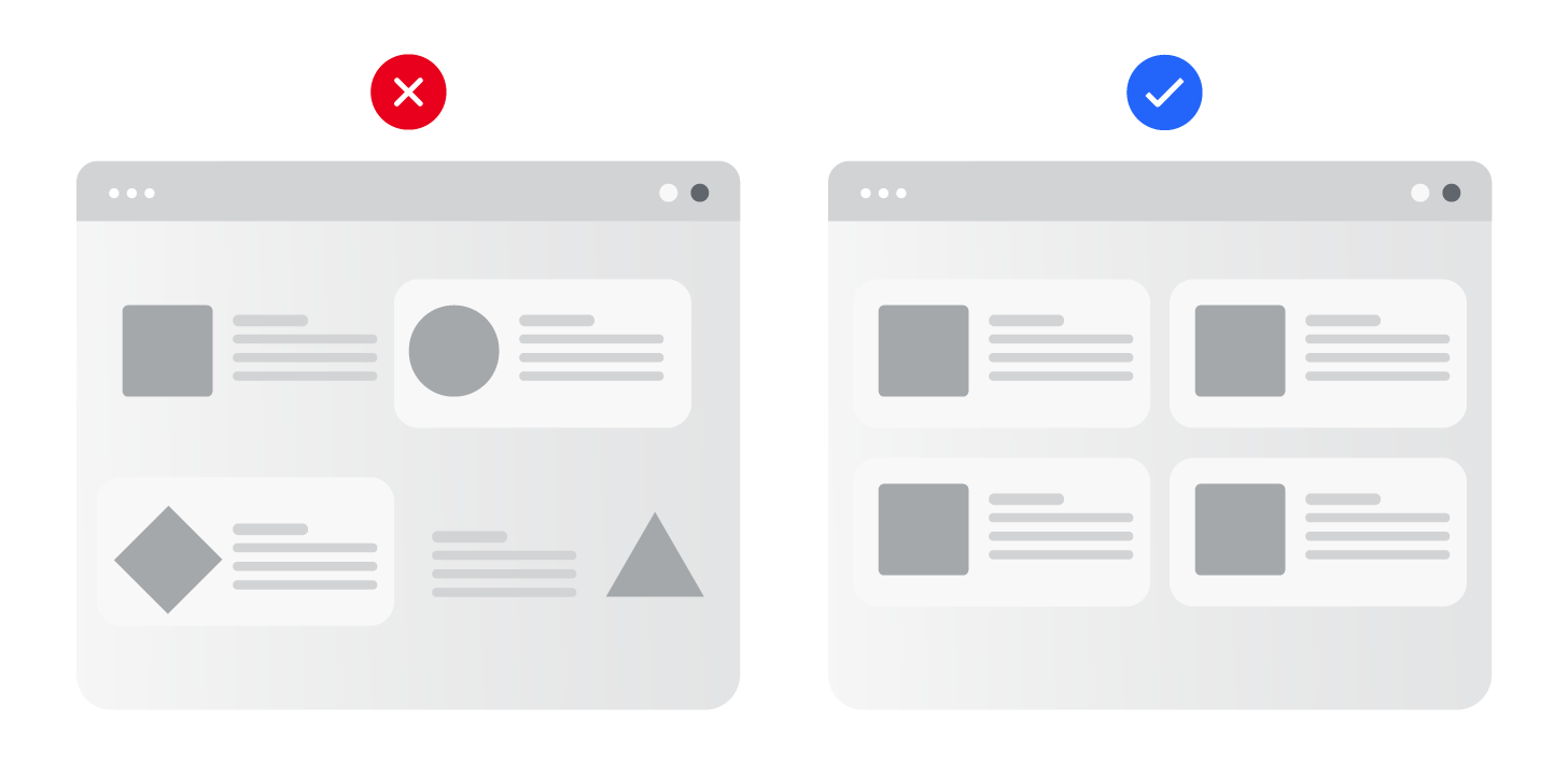
8. Repetition
Consistent styles, patterns, and placement build rhythm and reinforce structure across the experience. Repetition helps users know what to expect. When done well, it makes the entire experience feel cohesive and thoughtfully designed. An example of this could be using the same link style to indicate a secondary call to action as opposed to a primary.
Visual hierarchy can be a roast beast, especially at the start.
When I first sit down to design, I sometimes freeze up wondering how to apply all the principles in a way that works. With tons of content and competing priorities, it’s easy to feel stuck.
But once you understand the fundamentals, it really does get easier. You start to think more systematically, which ironically gives you more creative freedom to explore and experiment with intent.
Here are a few steps I rely on at the beginning of a project to stay grounded and keep my eyes on the big bois.
Practical ways to strengthen visual hierarchy
1. Start with the Story
Before jumping into the layout, get clear on what the page is trying to say and what action it’s driving. Understanding the purpose, user intent, and content is essential to organizing information in a way that supports clarity and keeps users engaged. Think of it like a story: a beginning that presents a problem, a middle that guides the user through the experience, and an end that offers a solution or next step. And that’s why information architecture is so important, but that’s a whole topic on its own.
How it helps:
- Ensures unique pain points are understood
- Creates empathy with the user
- Sets the scene for a success
2. Organize the Key Players
Once the story and goals are clear, identify what needs to stand out, what supports it, and what can stay in the background. Headlines, subheads, body text, CTAs, and links all have different roles. Understanding those levels will help determine what specific elements should take center stage and what ones can act in a supporting role. Knowing all the moving parts will make organization within a layout easier.
How it helps:
- Defines all the players and their roles
- Makes organization decisions more evident
- Gives insight into areas that can be consolidated
3. Pick a Grid System
Start by selecting a grid that supports the type of content you're designing. Whether it needs to accommodate left-side navigation or multiple content areas, the grid should match the content needs from the start. It brings structure and balance to the page and is critical for responsive design, keeping key content in focus across all screen sizes. An effective grid also acts like an invisible narrator, quietly shaping how users move through the content. It also sets the foundation for reusable templates, helping copywriters understand layout constraints and write accordingly.
How it helps:
- Ensures layout consistency across pages
- Makes responsiveness more effective
- Promotes scalability for the future
4. Get the Typography Right
Typography could easily be its own blog post, but here are a few key things that really matter. It's surprising how often it's overlooked in UX, especially considering it's one of the most important elements of any website. This is particularly true for content-heavy pages, where clean, intentional type can make or break the experience.
Spending extra time fine-tuning line width, headline sizes, section spacing, and type scale can significantly improve the effectiveness of a layout and help users retain information more easily. And when content editors rely on rich text editors (RTEs), getting the styling right from the start ensures consistency across every page, no matter who’s hitting publish.
How it helps:
- Improves readability
- Strengthens brand presence
- Makes site appear polished and professional
5. Become Familiar with the Visual Flavor
At the start of a project, I like to create a visual library that includes brand essentials such as fonts, colors, icons, buttons, and imagery, and take time to really explore it. Seeing all the elements together not only helps me design with intention and stay true to the brand, but also makes it easier to spot natural ways to visually categorize content.
Grouping elements upfront reveals patterns, like which styles work best for primary actions, supporting details, or repeated structures. I often experiment by designing common content blocks and applying different treatments to see how they function in different contexts. The more familiar I am with the visual building blocks, the less guesswork there is when it’s time to make design decisions.
How it helps:
- Reinforces the brand identity
- Better design decisions
- Brings the content to life
6. Avoid Visual Overload
Just like an over-seasoned dish, a layout with too many colors, elements, or competing visuals can overwhelm the user and dilute the core message of the page. When everything demands attention, nothing truly stands out.
Too many choices or distractions can lead to cognitive overload, which often results in lower engagement and a more frustrating user experience. This can ultimately reflect poorly on your brand.
To ease this strain, consider simplifying the interface with strategies like truncated content or accordions, as long as they remain accessible and easy to use. Also, avoid cluttering the page with decorative images that don’t support the content. Every element should serve a purpose and support the overall communication goal.
How it helps:
- Reduces cognitive load, improves retainment
- Makes intent clearer leading to better engagement
- Supports accessibility for all
Summing it All Up
Incorporating visual hierarchy into your UX design isn’t just a best practice, it’s fundamental for good design It’s less about creating an aesthetically pleasing design (though it still improves any aesthetic) and more about guiding someone through a story, helping them focus, take action, and get exactly what they came for. Done well, it transforms content from chaos into clarity.
Hierarchy supports everything from readability and accessibility to SEO and performance. It reduces friction, boosts retention, and makes even the most complex layouts feel intuitive. And the more you experiment with these principles, the stronger your design instincts and process will become, freeing you up to spend less time second-guessing and more time being creative.
Next time you're scrolling through a site, take note of how the content flows. Ask yourself: Where does the page want me to look first? What feels clear and what feels confusing? The best designs are the ones that don’t make you think too hard. They simply guide you, quietly and deliberately, like a good story should.
Ready to take your creative to the next level? Reach out to start a conversation about how Liquid can help you get there.