Campaign pieces that are monotonous clones. Flat ads that don’t catch eyeballs. User experiences that more closely resemble scrolling through word documents.
They’re tasteless visuals. We’ve all seen them, and that dull feeling they evoke is undeniable.
But identifying how and why that feeling happens? That’s sometimes not as easy to pin down. Even when you’re feeling this way about your own company’s visuals, it can be challenging to know what got you there and how to find your way out.
What might be contributing to these apathy-inducing displays? And how can we breathe some life back into these visuals to draw people in?
Let’s do a little digging and discovery to find some answers.
How Did You Get Here?
Repetition Overload
I can see why the perceived benefit of repetition is tempting. If there is an abundance of clear-cut rules to follow within a visual identity, won’t that result in a consistent look? While it may end up being consistent; it’s often consistently drab. Excessive amounts of rules result in limited layouts and visuals that are boring. Same, same, and more of the same.
It’s a Communication Mismatch
The visuals may be saying something. But that something may be the completely wrong something. When misaligned choices are made, viewers may not catch on to what you’ve been trying to communicate through your visuals.
You’re Missing the Right Tools
You may be trying to build a house with just a hammer and a box of nails. A strong visual direction needs enough options to create with and get each job done. A full, complete toolbox. If you’re limited, you’re left lacking the right elements to make something impactful for each scenario.
Let’s Bring it to Life
Flesh it Out
You may think that I’d prefer to have no guide at all, but that’s not the case. Rules and restriction are absolutely needed.
But the difference between a useful restriction and a debilitating one is this; an intentional connection to what you’re trying to communicate.
Ask yourself – is this built for that perceived ease and illusion of consistency we previously talked about with repetition, or is this rule connected to what we’re trying to convey?
If it’s just there for that perceived ease and illusion of consistency, it may be time to leave it behind. Every decision, whether it’s the color palette or typography, should have a purpose in your story, backed by reasoning fueled by lots and lots of meticulous thinking.
That’s the consistent fibers truly needed to keep every visual strongly connected.
Fully Stock the Kitchen
You can’t stock a kitchen with extremely limited utensils and ingredients, expecting to get a multitude of mind-blowing meals out of it.
Limited tools create limited outcomes.
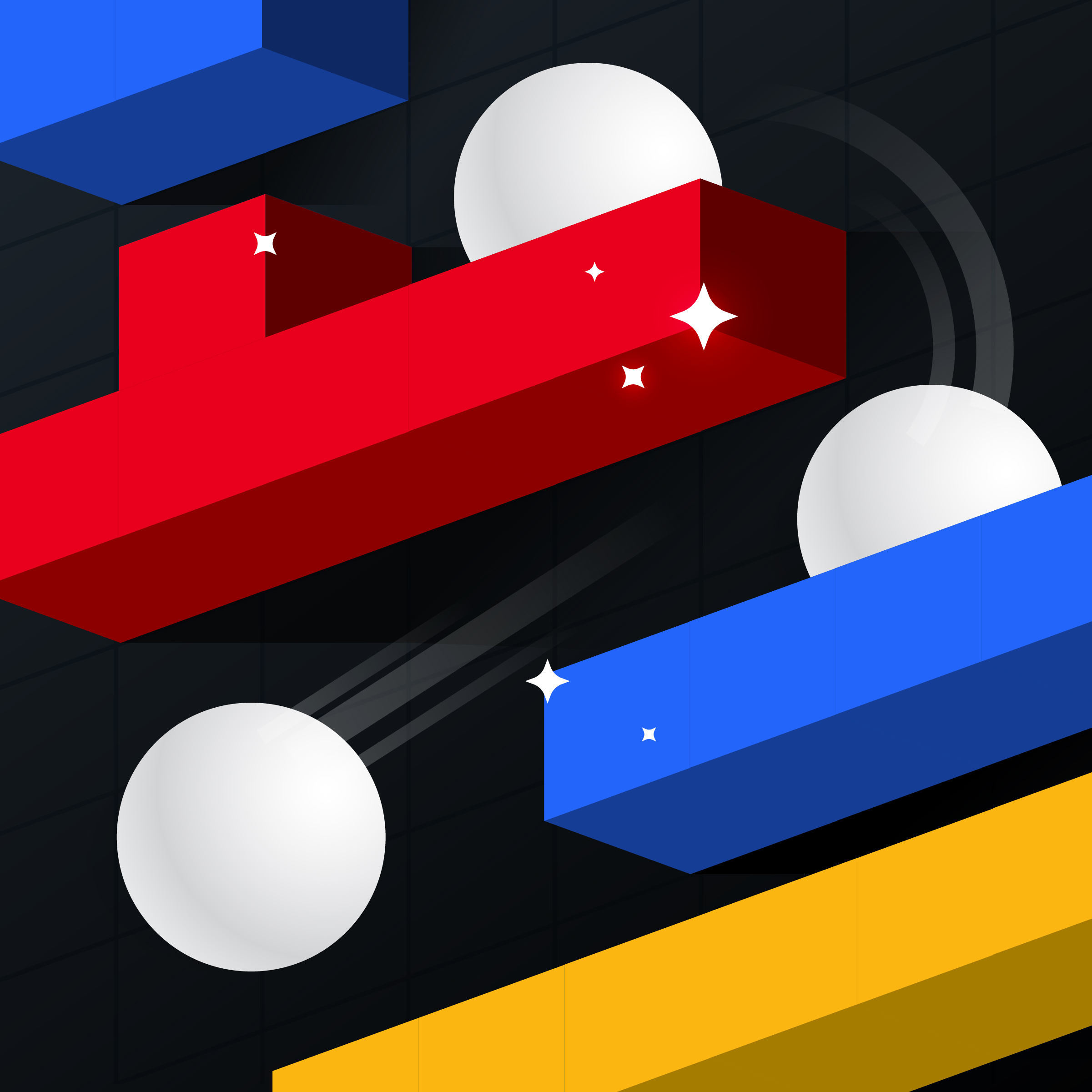
If your visuals are feeling lackluster, you may need more to work with. Sometimes this means adding additional options to your color palette. Or possibly including new graphic elements and patterns, or even some 3D illustrations (check out the benefits of incorporating 3D laid out by my coworker Dolan) to add more spice. These additions should bring more appetizing variety to the table.
And Don’t Kill It
Visual identities are living things. They aren’t meant to be decided upon, never touched again, preserved, and anchored in place till the end of time.
They should be able to grow and evolve (just like your business does).
It’s understandable why these dull visuals stick around. Set rules can feel wrong to change, despite their misaligned nature. Especially if they’ve been around for a while. You get used to them.
But what you gain in comfort, you can lose in something else.
The opportunity to keep growing. To evolve into something that is more accurately expressive of who you are. Development that could help people hear your message clearer and more precisely.
A good visual direction should give you that feeling of this is so us followed by an enthusiasm for what’s next. And trust me, it’s possible. (I’ve seen it. A client strongly connecting to a visual direction is one of the best things I get to experience through my job.)
So don’t settle for stagnant.
No matter where you are or how long it’s taken you to get there, there’s always the opportunity to turn around and leave dull behind.
Ready to Steer Away from Stagnation?
Maybe it’s time for a bit of a refresh, or even a complete redirect. Luckily, we have a crew of individuals who love thinking through every decision and putting their whole self into their creative services, with a strong distaste for blah. If you’re looking for visuals that stick, get in touch!