The Thinking Behind Our Visual Identity
Our visual identity redesign started with the same loaded question everyone’s overhauls start with: what really defines Liquid?
After stacking lots of bad ideas, a concept finally began to surface—the idea of being like water. Yes, a company named Liquid took a long time to settle on water as the foundation for visual expression. As the saying goes, sometimes you can't see what's right in front of you.
Water is great though, It's adaptable, cohesive, and always in motion, and it became the lens for everything that followed: a system that could shift and change while staying true to its core.
Eventually, that idea grew beyond just adaptability. It became a reflection of our honesty and the people who make Liquid what it is. Like water is made of hydrogen and oxygen, two elements essential for life, Liquid is made of people, curious, collaborative, and experienced. They are the elements that give meaning to everything we create.
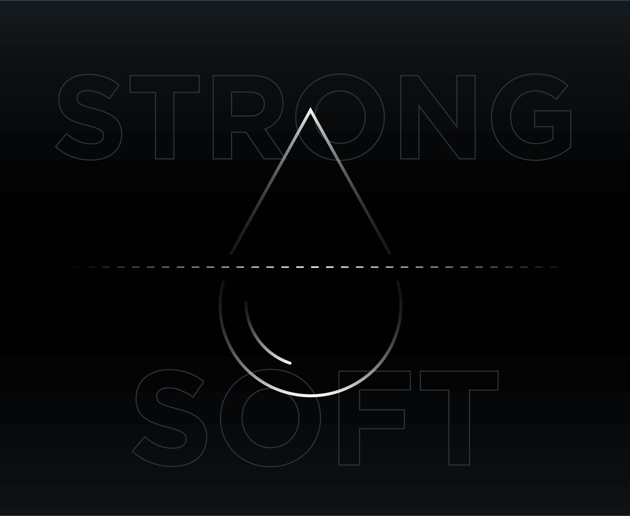
When we looked closer at the shape of a single water drop, something clicked. We noticed it had two distinct sides. One is soft and rounded, the other is sharp and defined. That contrast mirrors who we are, a team with a strong, bold presence paired with a softer side rooted in compassion and realness. And when you break that drop apart, the geometry can be deconstructed into many smaller shapes that carry a similar character and contrast. This insight stayed with us as we explored our logo and crafted the visual identity system that grew from it.
That philosophy shaped the kind of visual system we needed. Something that could evolve with our imagination, not be burdened with restrictive rules, while keeping pace with a constantly changing world. Marketing moves fast and our identity is designed to move with it. The constraints we put in place are only to ensure a fundamental cohesion, not to hold back something that should evolve over time.
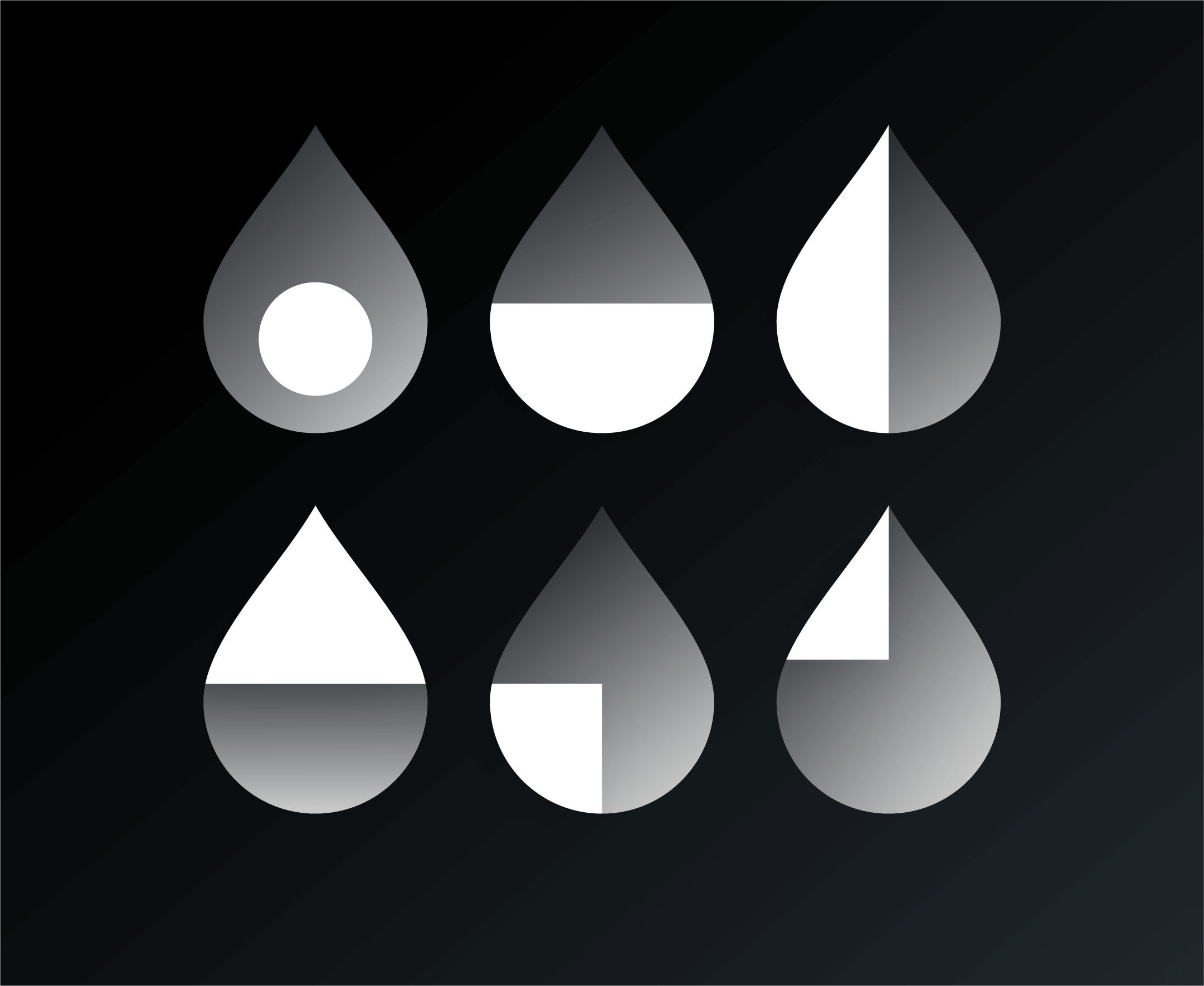
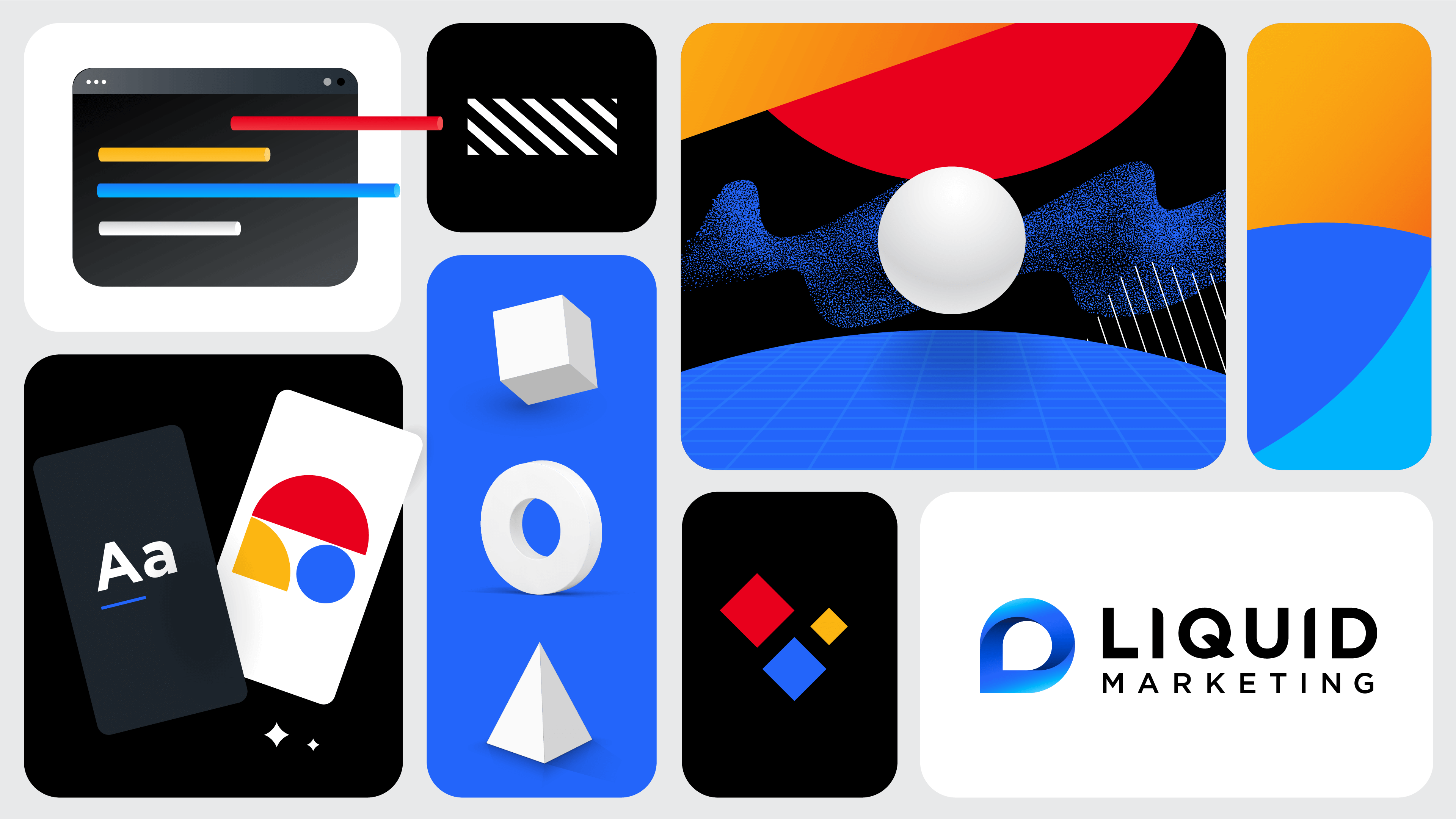
That’s how geometric shapes, became the foundation of everything we create. Shapes are fundamental in nature, appearing everywhere from microscopic forms to the vast systems that make up our world. That universality made them a natural starting point for our identity. Some of our shapes are simple, others more abstract, and together they work like a toolkit, giving us structure when we need it and freedom when we do not.
Our Logo
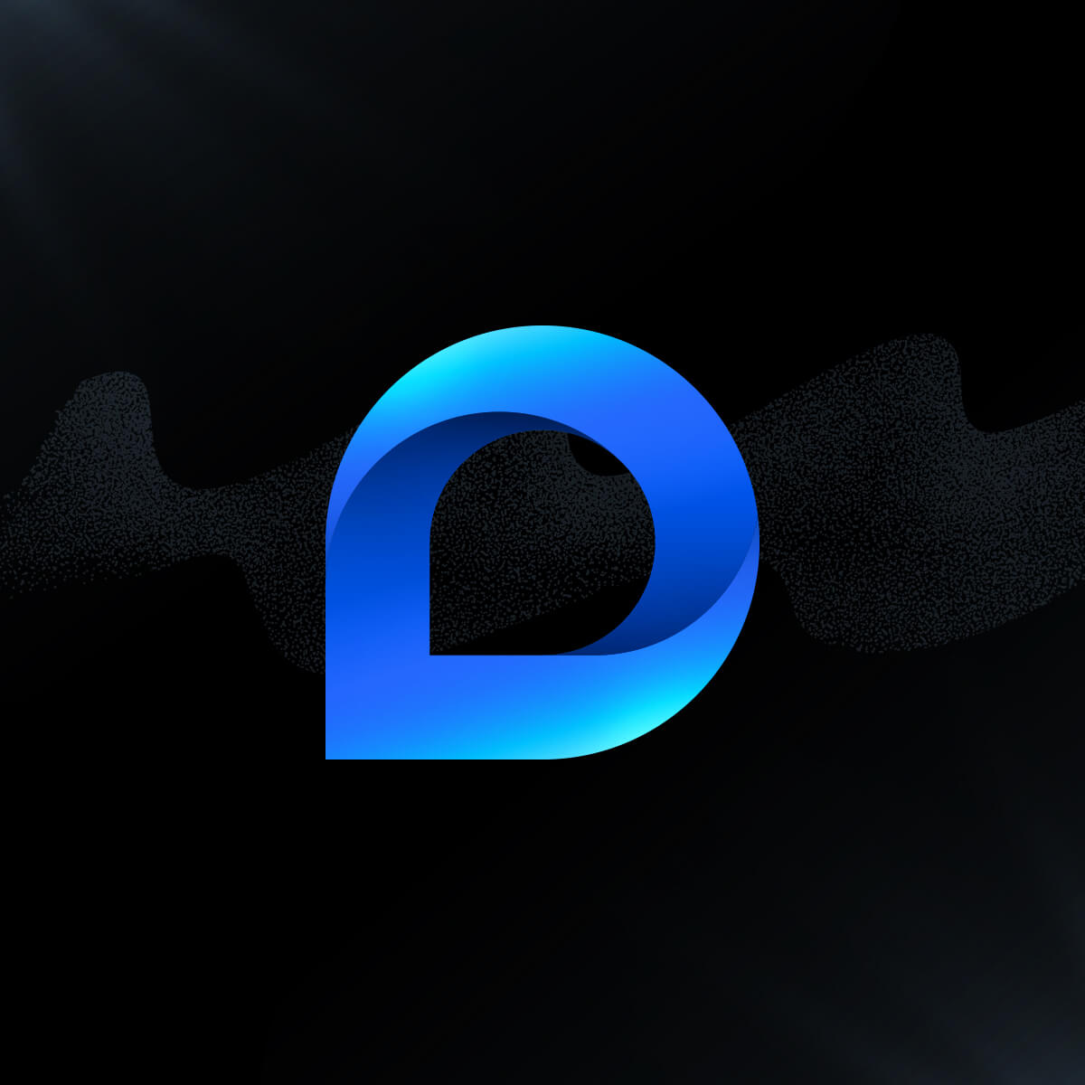
Our logomark distills what Liquid stands for in a single shape. The mark, a water drop pointing upward, represents focus, direction, and determination. It is a reminder that even what naturally flows downward can rise when driven by purpose.
The vibrant blue and subtle lighting inside the mark add another layer of meaning. The way the light hits the top of the form creates the feeling of light reflecting on water, reinforcing the upward motion and clarity behind the symbol.
Alongside the mark, our wordmark brings its own presence. The bold, geometric letterforms pack a punch, giving our name more weight and confidence. Each “i” has a curved edge that echoes the drop shape, creating a mix of sharp and soft details that adds a subtle sense of play. Instead of every letter following the same rules, these small differences give the wordmark a personality of its own while staying rooted in the same visual logic.
What was once defined by thin lines now carries more strength and clarity, designed to stand out with confidence while remaining connected to its core idea.
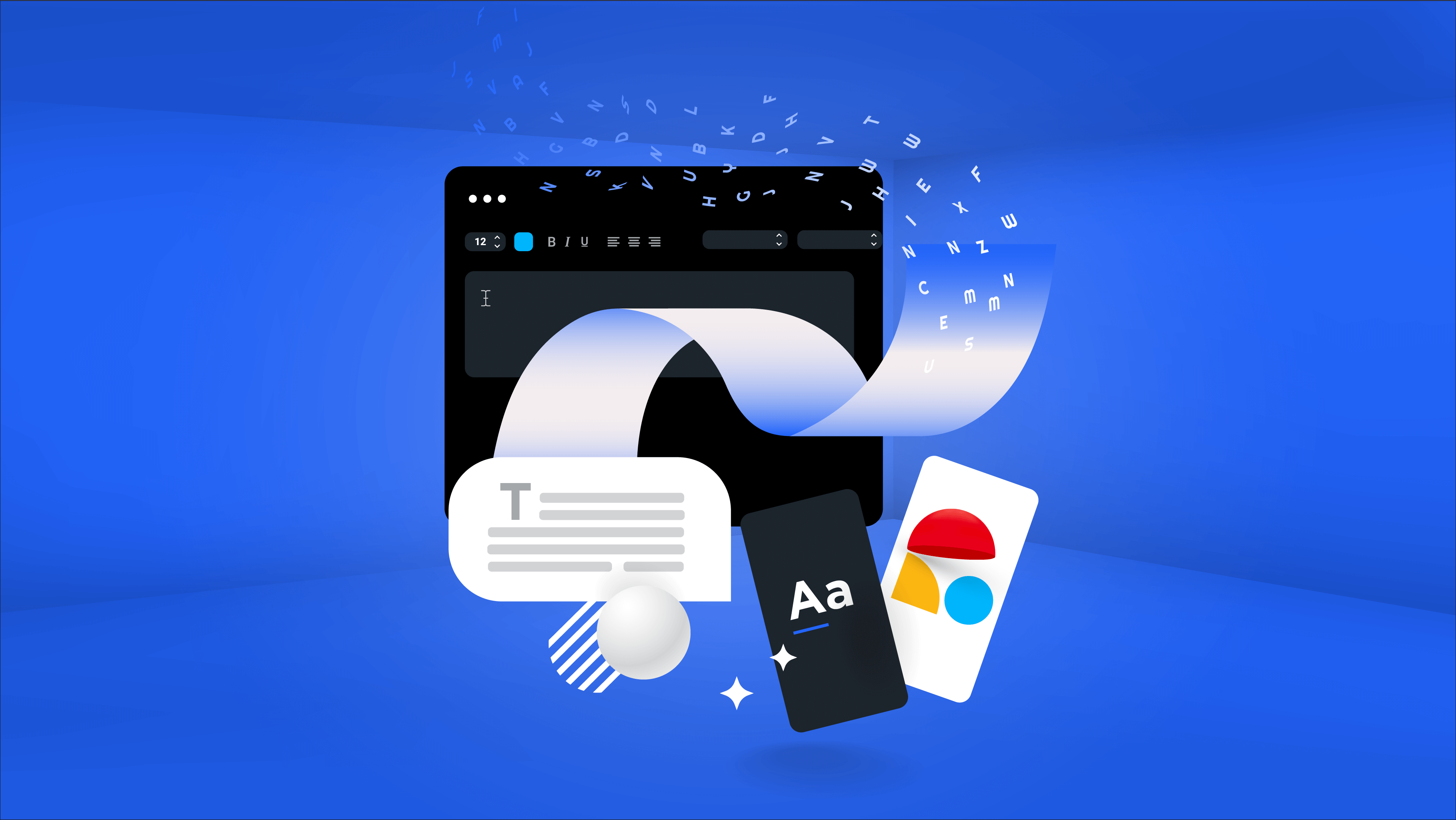
The Elements of Our Identity
Our identity is built from the same tools that fuel imagination: color, shape, type, and movement. These elements form the building blocks of a visual world that are structured yet open to exploration. They allow us to be simple and intentional when needed, or expressive and exploratory when the story calls for it. Together, they help us create work that feels connected, dynamic, and unmistakably ours.
Color
Color is the most immediate way people recognize us. Our palette takes inspiration from the visible light spectrum in nature, giving us bold hues that feel lively and expressive, reflecting the spirit of the people behind the work. Each color has its own voice and its own flavor, yet blends seamlessly with the rest of the palette.
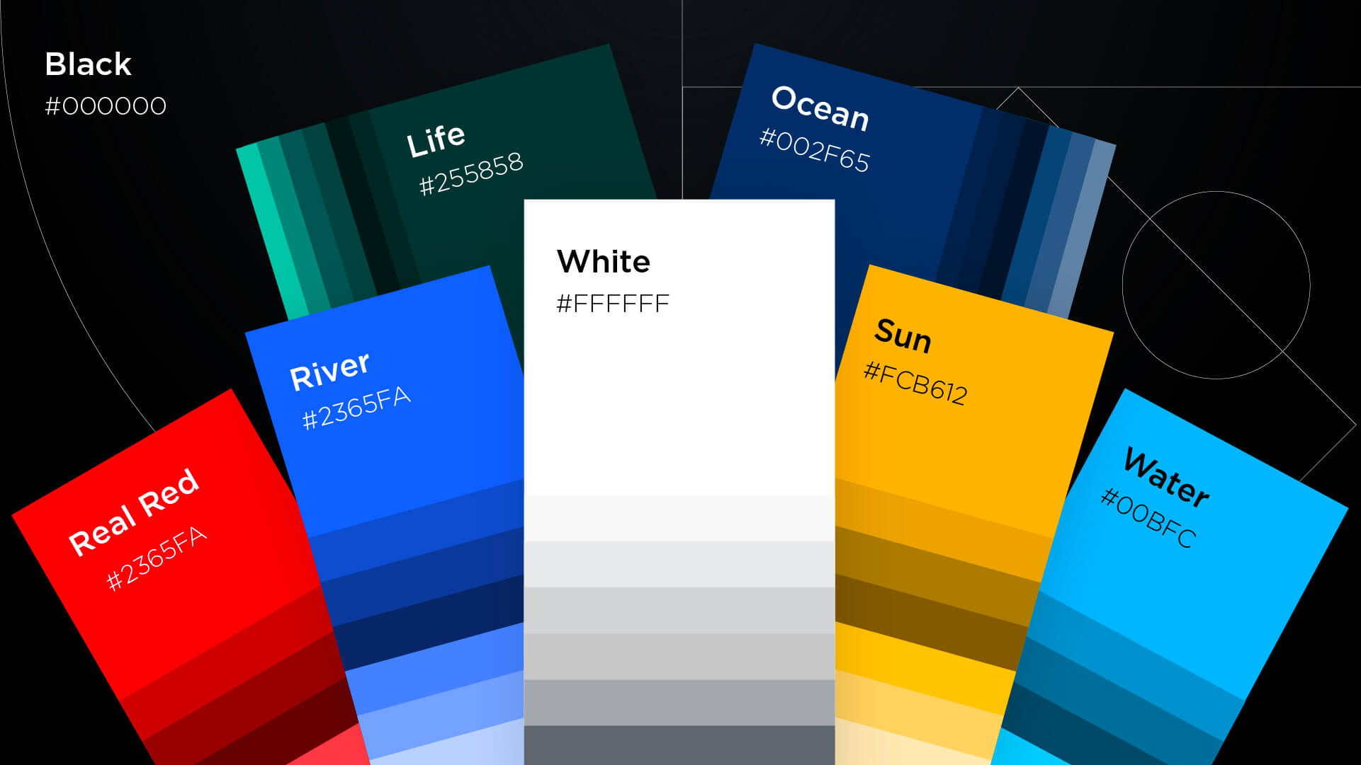
Black and white serve as our foundation, especially in typography and copy-heavy moments. These colors give our work room to breathe and allow the message to lead, while our bold colors step in, together or on their own, to bring personality and emphasis when the moment calls for it.
By applying our palette with different intensities, from quiet neutrals to expressive color stories, we keep our visuals fresh while drawing from the same core system.
Shapes and Lines
Our geometric shapes and lines act as the framework for everything we create. They form the foundation of our compositions and adapt easily whether we are building something minimal or more complex. In 2D, they guide how each element sits and interacts on the page. In 3D, they gain depth and realism, helping our visuals feel more tactile and alive.
In our system, 2D and 3D elements live together naturally. Some visuals feel more graphic and flat, others lean into depth, texture, or atmosphere. They might look completely different at first glance, yet they share a visual thread. The same underlying forms and structure connect them, which is what keeps the identity feeling like Liquid even when each piece has its own personality.
Since we describe ourselves as being like water, and shapes serve as the molecular foundation of our system, we sometimes take a "zoom-in approach" with our compositions. We look at the big picture, but we also pay attention to the small details that define the quality of our work. This is the same way we work with our clients. We understand their world broadly while taking time to focus on specific moments and decisions because we believe that's what really moves businesses forward.
Some shapes are precise and intentional. Others are more abstract and expressive. Together, they form a visual language that is flexible enough to grow and focused enough to always feel like us.
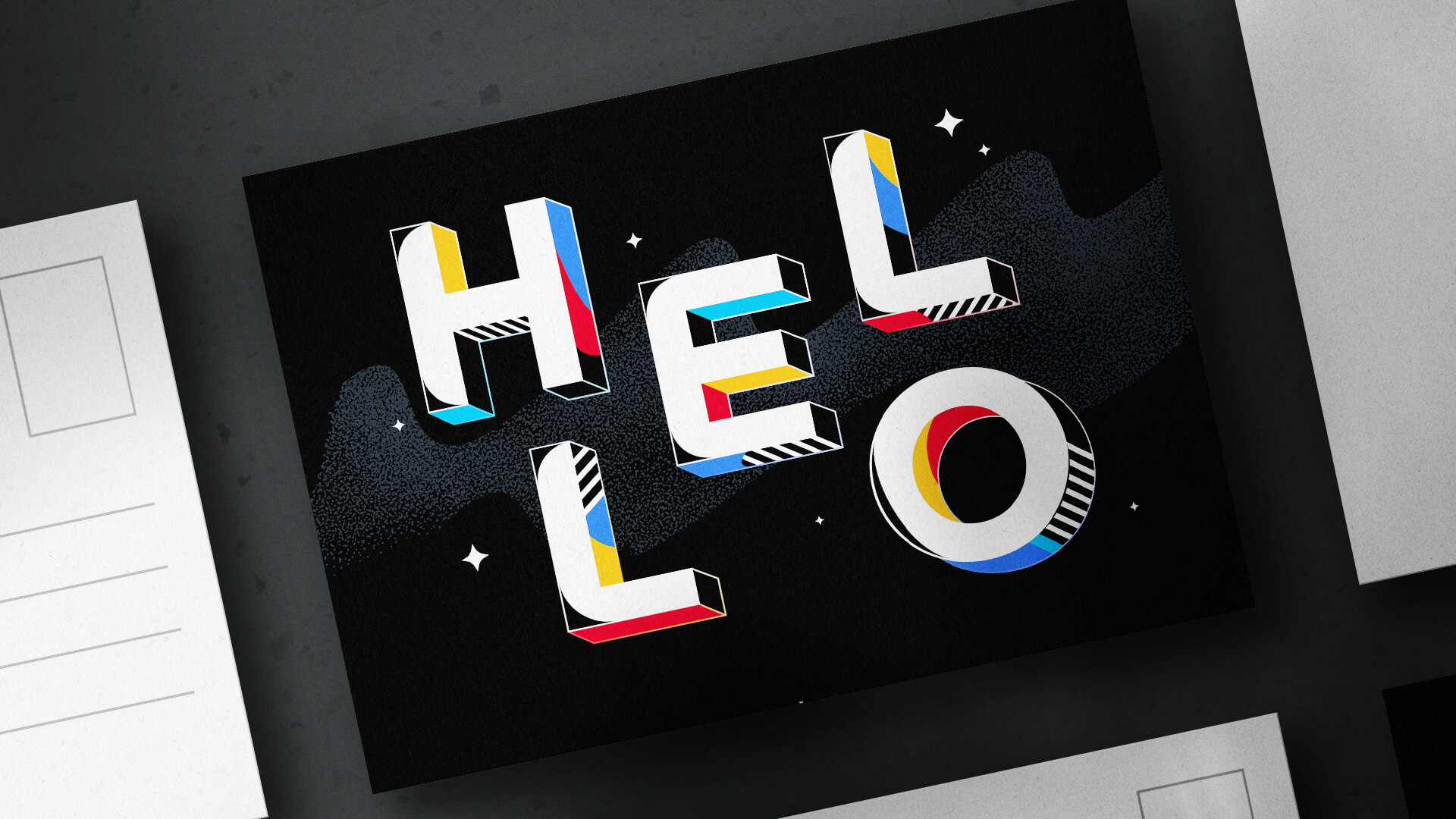
Typography
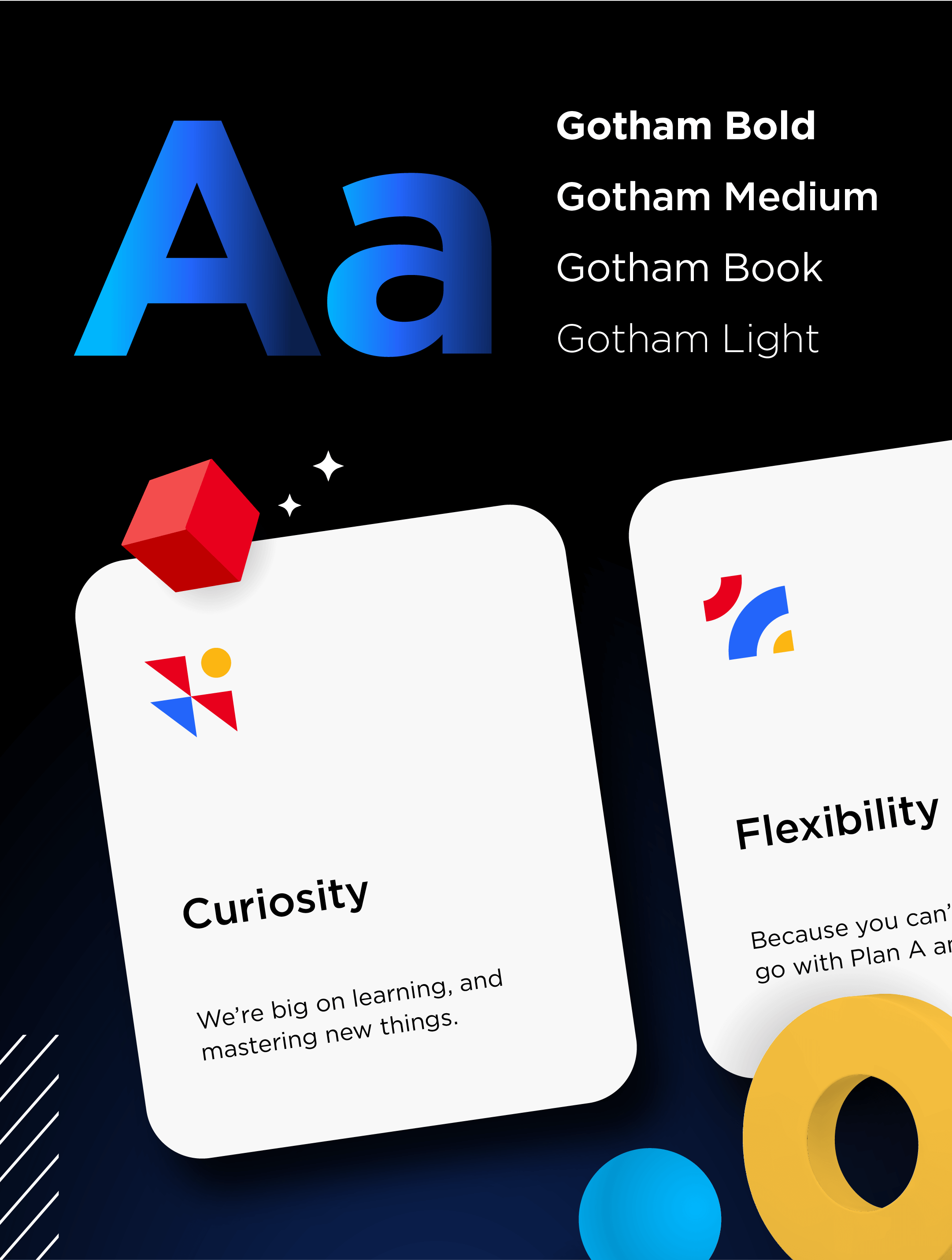
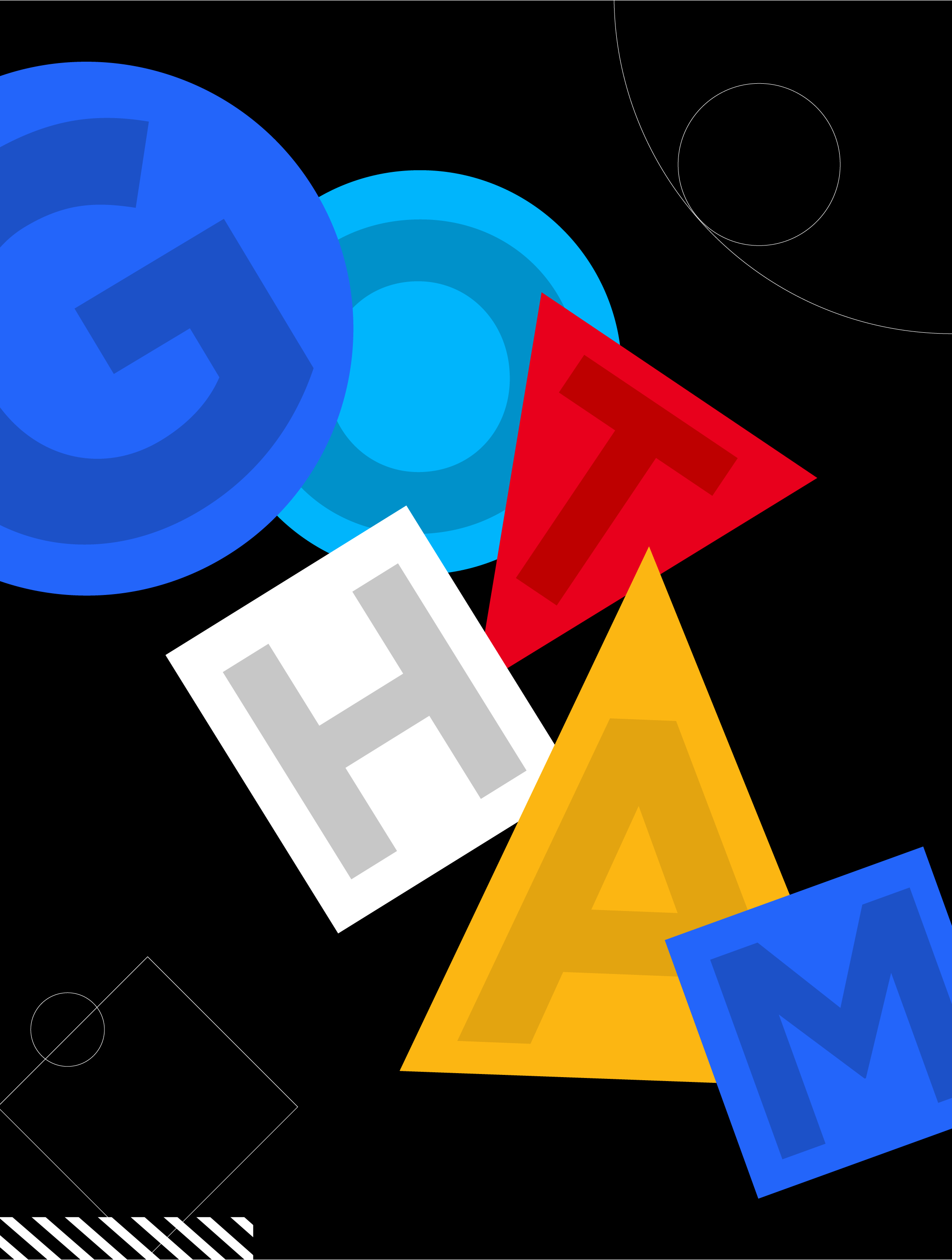
Our typography reflects the same balance we look for in the rest of our system. Clear, confident, and built to communicate without getting in the way. We use Gotham, a typeface with geometric roots that feels modern and straightforward. Gotham holds up wherever it is used, on a huge screen, a tiny mobile header, or a printed page, which makes it a reliable foundation for our voice.
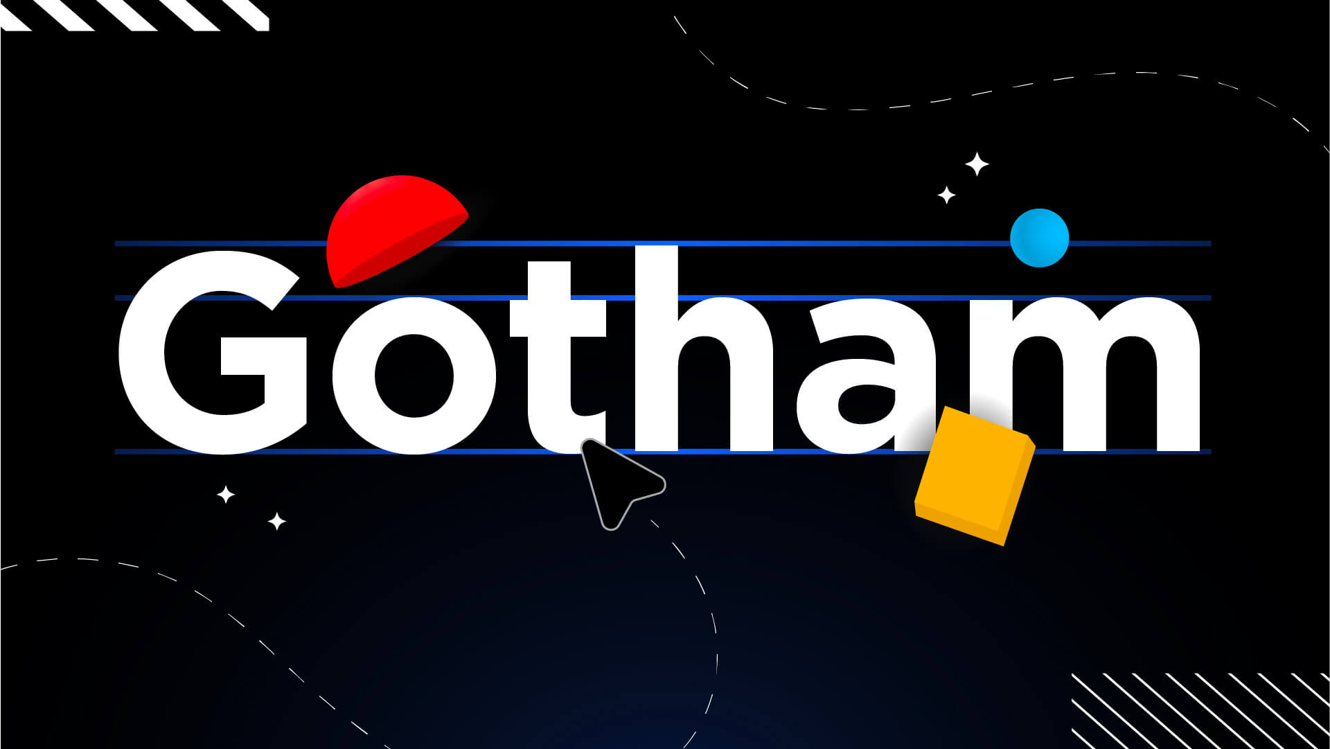
What makes Gotham feel right for us is the mix of sharp lines and rounded curves. It carries the same qualities we value in our work. Strong but approachable, structured, but flexible. It pairs naturally with our shapes and visuals, giving our words personality while keeping everything cut from the same cloth.
Movement and Depth
Movement and depth help our visuals operate in a world of their own. Lighting, shadows, and soft focus create a sense of individuality, giving each piece a clear point of view. We use gradients to support the lighting and add another dimension to our designs. They also help carry the same sense of glow found in our logomark.
These details bring the sense of exploration we value, giving each piece its own environment and its own flavor within the system.
A Progressive Evolution
Great branding has always been about meeting people where they already are. The landscape around us changes, the platforms change, and the noise gets louder, but the core idea stays the same. Every visual moment matters, and staying relevant means evolving without losing your foundation. It's important to remember that foundations aren't an arbitrary set of rules finalized at some moment in time, they are a collection of core philosophies that exist whether or not you've created a brand book.
Our evolution happens naturally through the work itself. Each new expression builds on the last, expanding our visual language in intentional ways. Like water, our identity adapts and moves with purpose, always learning and always progressing.
This isn't about changing who we are. It is about showing more of what makes us Liquid, all the ham included, and doing it with the curiosity and energy that drive our work every day.
Still at our core. Always in motion.