
Does this ring a bell: spinning logos, auto playing background music, blinking Comic Sans, and sparkling, eye-melting backgrounds? I bet it does.
Not too long ago, bad web design was easy to spot. It still exists today, but it may not be as glaringly obvious.
It’s my job to obsess over website design, user experience (UX), and information architecture. I mean, I can’t even check the weather without fixating on navigation design improvements.
And from my experience, while spinning logos may no longer be in vogue, there’s still a lot of room for improvement in today’s webverse.
But where to begin? What are today’s biggest website design mistakes? Here’s how they’re ranked in a quick Google search (and my perspective of each).
1. Information Overload
In my formative design days, we called it putting “10 pounds of rocks in a 5-pound sack.” This tip’s an easy place for us to start because it’s the most obvious. Website clutter is overwhelmingly distracting.
You’ll often see overcrowded navigation bars, news alerts, banner popups, thick walls of text, and overly-stuffed component designs, but there are countless ways to create information overload. This condition confuses users and creates an obstacle for them to complete their tasks.
Hick’s Law says the more choices you present to a user, the longer it will take for them to make a decision. That spells disaster for a cluttered website’s UX.
As you add content or plan your website design, be protective over your users’ experience. Always make sure you are presenting them with a minimal and scannable amount of information in each region of the page. Reserve the top hierarchy for the most important information and choices only and go from there.
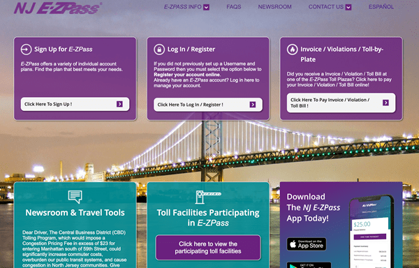
New Jersey’s EZ Pass website (ezpassnj.com) displays an overwhelming number of choices.
2. Pop-up Insanity
Initially, I didn’t consider this as being a “top tip” because things are waaaay better off than the frontier days of the internet when web design ran wild like spooked mustangs.
But it’s a valid concern.
Many websites are out of control with automatically generating pop-ups and overlay panels. It’s like being forced to play a game of pop-up whack-a-mole with cookie alerts, newsletter offers, free shipping promo codes, chat bots, and surveys about your experience all flying at you. It’s a close, close, close world and you probably haven’t found what you came to see.
One of the best ways to prevent this is to determine what is necessary to force in front of your users. Is it really that important to your and your users’ goals?
Many times, pop-ups can be avoided altogether with well-placed on-page content that doesn’t need to jump out at your users. Consider whether enlisting a pop-up is truly the best solution, or if you are not giving your audience enough credit to find what they need.
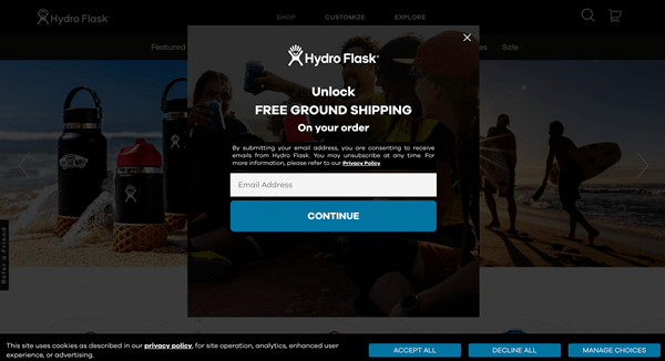
Hydro Flask’s website (hydroflask.com) requires multiple choices before you can actually see products.
3. Unclear Communication & Navigation
A website is nothing if not a vehicle for information. But what good’s a fancy car if it won’t take you where you need to go? All too often, websites cause unneeded stress or frustration while failing to help you get the information you need.
The foundational principles of user experience include clear navigation, organized content hierarchy, directive calls-to-action, clean design, and concise messaging, among various other elements. These are all used to structure a journey that provides an easy and intuitive information discovery for you the user.
There are a few methods for optimizing your navigation and communication, and they all begin with putting yourself in the mindset of your users. Who are they? What are they looking for? What are your answers to their questions?
This simple effort creates a discovery of user needs and motivations. From there, you can identify the primary navigation paths and the messaging that helps support them.

Navigating Yahoo’s fantasy football page (https://football.fantasysports.yahoo.com/) offers confusing choices, even to the returning user.
4. Lack of Responsive Design
Today there’s just no excuse for why your website won’t accommodate the wide varieties of screen sizes. Smartphones, tablets, and monitors of all sizes are being used like never before.
Luckily, just as consumer technology has advanced so has design software, so the responsive design process has become essentially a no-brainer activity.
Nearly 60% of all website usage is from mobile phones, according to Statcounter research. If you’re not presenting content for this audience, you’re probably missing out.
Responsive design is widely accepted, but there are certainly some outliers who have missed the memo. But even if your website meets basic responsive design, there may be a few areas that aren’t cutting it.
Perform a walk-through of the less common content elements. Check to ensure that your contact forms, your tables, large images, videos, PDFs, downloads, and all other documents meet the needs of a mobile user.
Always plan content in terms of mobile first design. Begin at the smallest common screen sizes and move your way up.
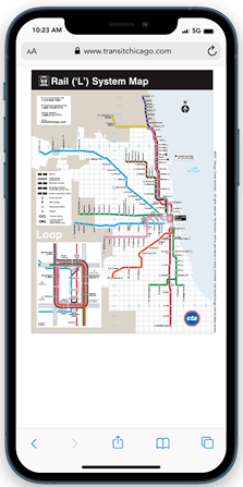
This Chicago Transit Authority map (https://www.transitchicago.com/maps/) does not provide optimized mobile tools.
5. Lacking Accessibility
I explored this topic on a previous post, so I feel safe quoting myself:
“Each day, websites fail web content accessibility guidelines, because they are unintelligible to those with vision, hearing, and other disabilities, due to shortcomings in the websites’ design and development.”
The internet is designed to be the great equalizer, delivering information to those who otherwise would be challenged to reach it due to physical, visual, geographical, audible, and other challenges.
If your website doesn’t meet the foundational guidelines of website accessibility, then not only are you overlooking an important audience but you’re also enlisting potentially discriminatory practices.
Begin today by examining your existing content and website structure and take necessary action to hire the expertise needed to keep moving forward with Americans with Disabilities Act (ADA) guidelines.

This popular fashion website features a stylish yet difficult to find navigation. Luckily, it features an Accessibility tool that corrects issues for disabled users.
Wrapping It Up
Of course, there are countless ways you can destroy a user experience, so this isn’t a comprehensive list. But there are issues I feel all business websites - like yours - should keep in check.
Hoping this list of top website mistakes will inspire you and guide your web team to create a more positive and productive experience for your users.
Please don’t hesitate to contact us with any questions about your website’s user experience or design, and check out other articles on the Liquid Blog for more industry thoughts, insights, and expertise.