
Patterns NOT Pages
One of the side effects of responsive design is that a lot of sites look similar, but responsive design isn’t solely to blame. The rise of WordPress sites and the booming theme market have also had a hand in it. The perception of websites having a similar look to every other site out there these days isn’t necessarily a bad thing. It’s partially a result of the new ways in which we consume the web, and it has resulted in a lot of common UI design patterns.
Design patterns have matured, and as such, there’s little in the way of innovation when it comes to UI patterns. In other words, a checkout will always be a checkout and it should function as such. The same thing applies with a login model. There’s no real reason to reinvent the wheel. UI patterns must guide users through a smooth experience.
“Patterns are recurring solutions that solve common design problems. Design patterns are standard reference points for the experienced user interface designer.”
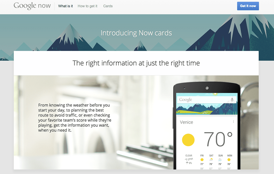
Google’s Material Design guidelines are usually mentioned whenever I read about this subject, and they’re well worth a look if you’re unfamiliar with them. Codecademy’s recent redesign was based around 10 guiding principles and UI patterns that could be used and reused, along with UI design templates.
For more on UI Patterns visit http://ui-patterns.com/
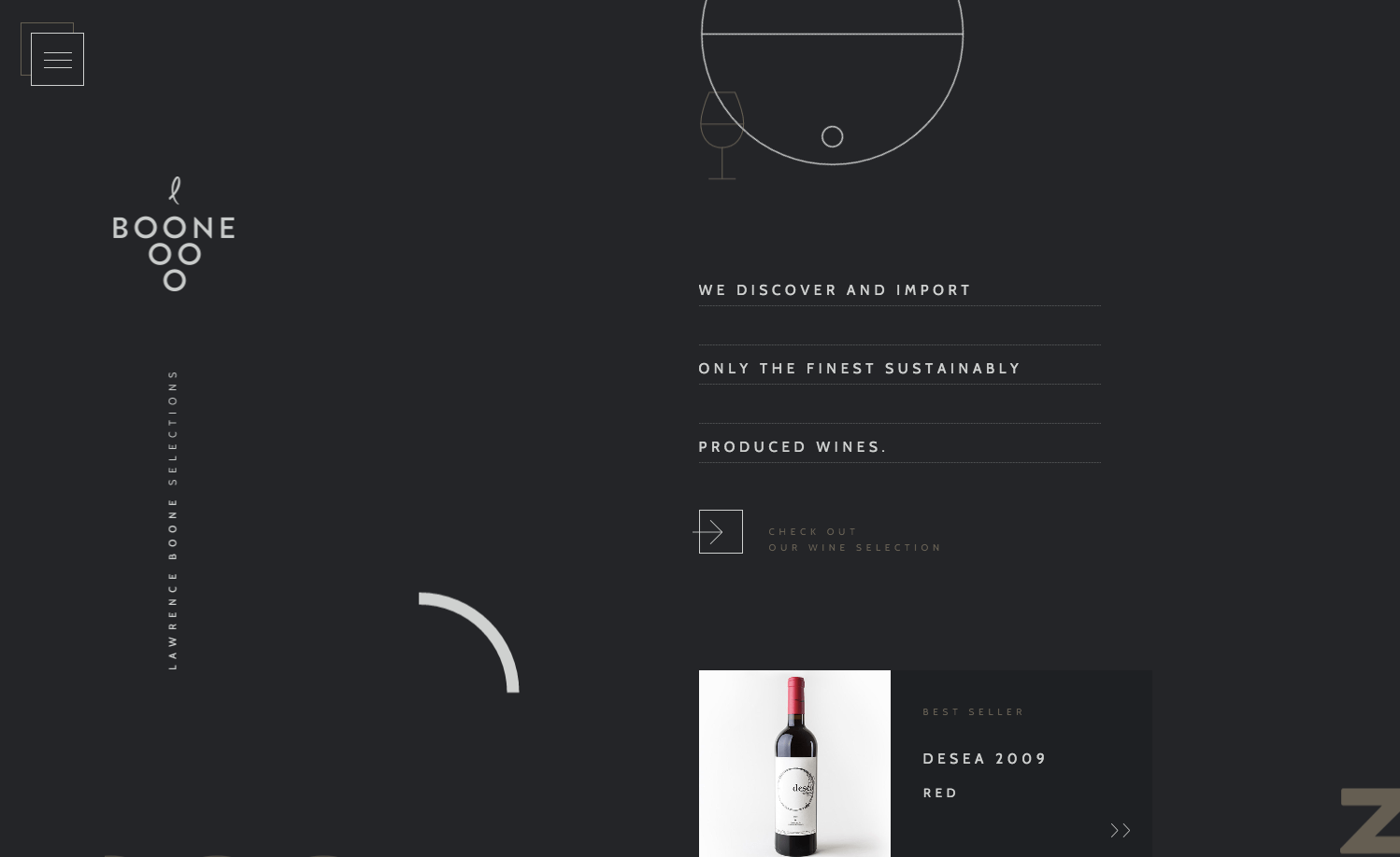
Long Scroll
Love it or hate it, it’s here to stay. The myth of designing to the fold is no longer relevant in a world where users expect to scroll. Long scroll is well documented as a great story telling mechanism, and it also lends itself really well to pattern based designs. The technique also works well for sites that want to draw in users through storytelling, and create true engagement with their brand or product.
Here are a couple examples of innovative long scroll experiences I particularly like.
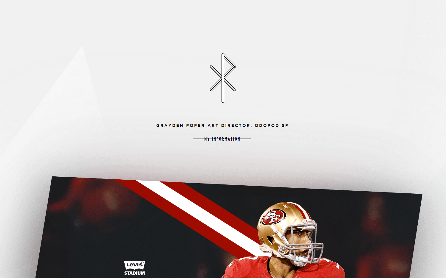
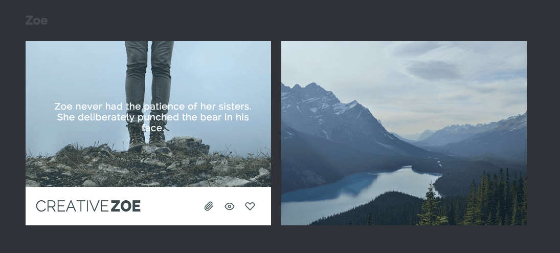
Grayden Poper
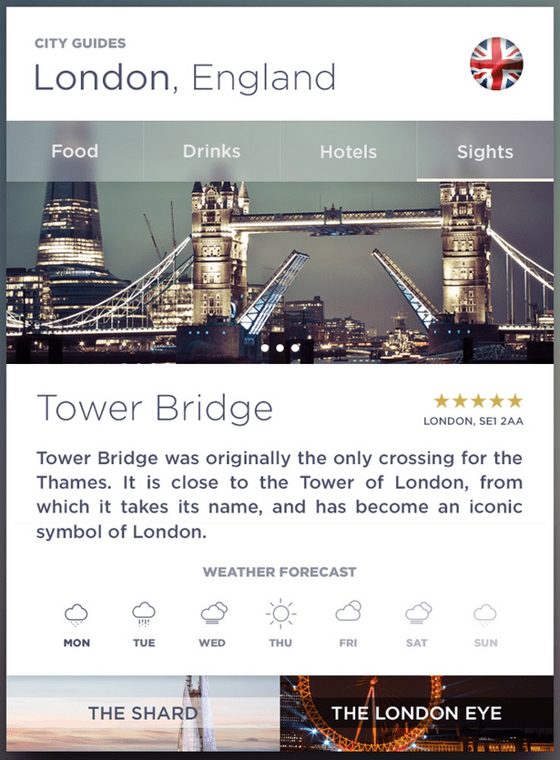
Web Cards
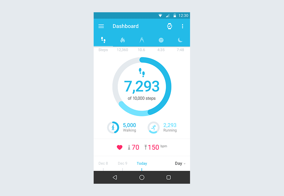
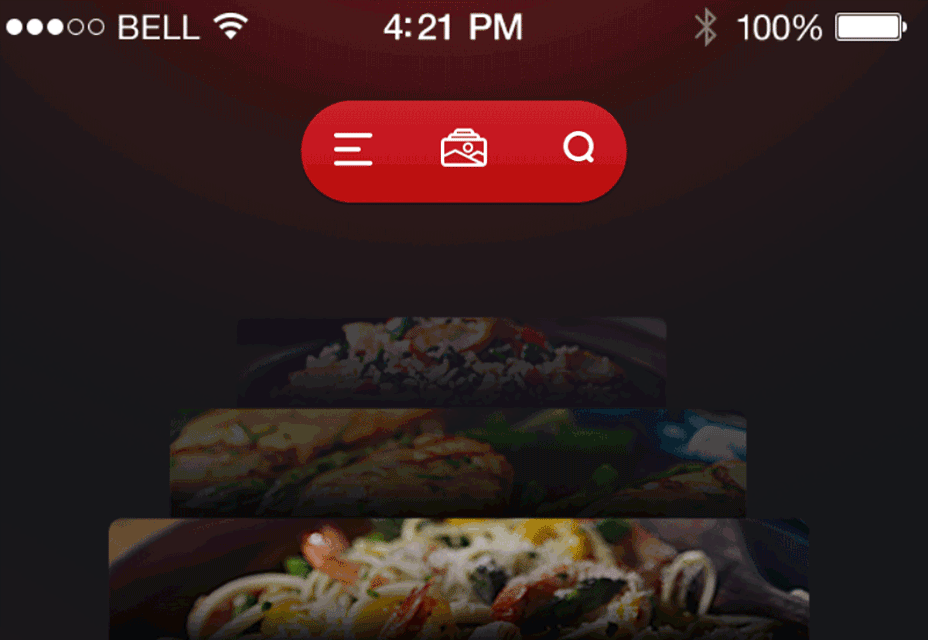
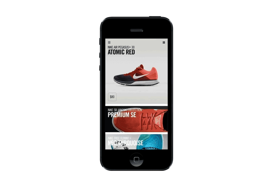
Pioneered by Pinterest and news websites globally, web cards are popping up everywhere. A card represents one concept, and presents information in bite-sized chunks that are perfect for scanning. Since they act as “content containers,” their rectangular or boxed shape makes them an ideal pattern to use in responsive design, and when tied together with continuous load you can share a lot of content in one unified experience.

Motion rich animations
Animations are being used more and more to enhance a site’s storytelling and create a more engaging experience for their users. But you can’t just toss an animation in any place. Consider carefully whether it adds to your site’s story, elements and personality or detracts from them.
Animations can be thought of in terms of two groups:
- Large scale animations: These are used as a primary interaction tool, have more impact on users and include effects like parallax scrolling and pop-up notifications.
- Small scale animations: These include spinners, hover tools and loading bars, and don’t require any user input.
A word to the wise though if you’re thinking of bringing animations to your web experience – ‘Keep them Simple.’ Overly complex animations may look cool, but can end up frustrating your users.
Here are some animations you can expect to see more of in 2016:
- Hover Animations: generally hover effects give a more intuitive and polished feel to a site. Users unsure about a feature’s function tend to hover over them automatically for instant feedback.
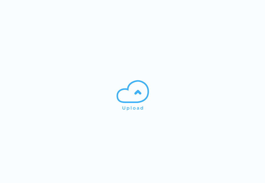
- Loading Animations: These are generally used to entertain users whilst waiting for sites to load. The ideal is to have no lag on page load, but while they’re there let’s entertain them and keep them engaged
- Motion Animation: As stated before, our eyes are naturally drawn to motion. What better way to draw people’s interest to your product and generate desirability for your users.
- Galleries & Slideshows: These are nothing new, but galleries and slideshows are an effective way to showcase multiple images without overburdening the users.
For more inspiration, look here http://tympanus.net/Development/HoverEffectIdeas/
Micro Interactions
What are micro interactions?
Micro interactions happen all around us, from turning off the alarm on your mobile phone to liking a picture on Facebook, or sharing a thought on twitter.
Each micro interaction is done without a second thought. It’s highly likely that you started your day with a micro-interaction.
Micro-interactions do, or help you do, several things:
- Communicate a status or give a bit of feedback
- See the result of an action, click or submission
- Help the user manipulate something.
Micro-interactions are a vital part of any digital application because they lead users to a path of more human-centered design. This concept of making devices more human-like in these moments is a key to adoption and usability. You’ll be hard-pressed to design a website or mobile app that does not include some element, or moment, that a user needs to interact with.
Material Design
As soon as Google launched its new style language, Material Design, the world took notice. It uses shadow effects and the concept of movement and depth in order to create designs that appear more realistic to the user. The goal of Material Design is to create clean, modernistic design that focus on UX. While Google’s design aesthetic has its detractors, it’s been mostly praised as a game-changer.
With its minimalistic look, Material Design has a lot in common with another growing trend — flat design. Material Design, however, makes use of depth and shadow, which creates a more pleasing aesthetic than straight up flat design.
Before now, we’ve seen the majority of Material Design projects limited to app design. I believe we will see this start to creep into websites soon though, especially with Google’s new Lite version. In any case, Material Design was intended to provide great UI and UX across devices. Material Design Lite doesn’t rely on any particular framework, so designers can use a wide variety of front-end tools to create their sites. It’s also lightweight when it comes to the HTML code, making for faster page loads and a better user experience.
2016 is going to be a truly exciting year for digital marketers and designers alike. I personally can’t wait to start having conversations with our clients about putting these projected trends into application, innovating and creating a truly engaging experience for their users.