
Feel like your brand’s color palette is missing something? Maybe recently there was an issue with legibility on your website? Or, maybe it needs a little more interest and 3 colors just isn’t cutting it?
It’s easy for designs to feel stale when your color palette isn’t fleshed out. Expanding your brand with some additional colors may be your solution. Here are some steps I would suggest to help get that process started!
Find Where Your Colors Lack
Spend some time reflecting on instances when you have wanted more out of your color palette.
- Was there an issue with contrast and a user couldn’t read information on your site?
- Is one color overwhelming the others?
- Is your brand’s color palette feeling dull and you’re craving more variety?
Asking these questions and reflecting on your previous experiences will help you understand what problems you are trying to solve. Keep these issues in your back pocket as you continue your journey towards a greater color palette!
Get Inspired
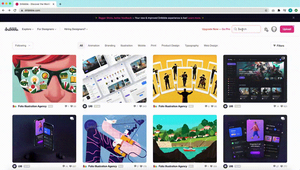
Evaluating color combinations that have already been utilized elsewhere is extremely helpful when you’re stuck in a rut. Examine brand inspiration you admire, or search for a specific color already in your branding on design sites like Dribbble or Behance. Identifying the additional colors other designs use will give you insight and inspiration on directions where you can expand your palette.
Create More Depth
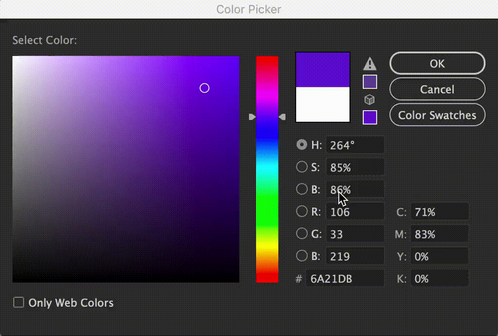
Take an existing color in your palette and test out some subtle adjustments. A great way to do this is to take that color into Adobe Illustrator or Adobe Photoshop and play with the saturation and brightness. These are both of the percentages next to the “S” and “B” on the color picker.
Saturation: Is the intensity of a hue from fully saturated to no saturation
Brightness: Is the darkness or lightness of a color from black to white
Adjusting these setting by about 20% is a great place to start. This will create colors that will easily go with colors already in your palette but are different enough to add depth.
Time to Experiment
Open up an Adobe Illustrator, Adobe Photoshop, or Adobe XD document and start testing out colors. Make different shapes with each color and see how they look together. If you have some past design projects, try adding your new colors into the mix. See what works, what doesn’t, or what needs to be tweaked.
Try using your brand font in different colors with a variety of backgrounds as well. Not every color has to work on top of each other, but it is important to make sure you have enough that do. These high contrast combinations will be important to use for any text in your designs, including your website.
Color Contrast is Key
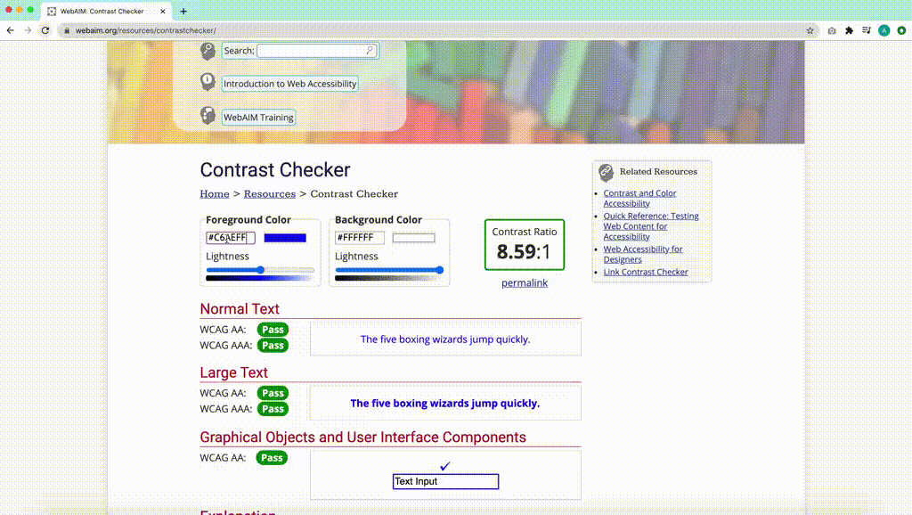
Color contrast is especially important for creating web design that is easily legible and accessible to all users, including those whose vision may be impaired. Run your text color choices from the previous exercise through an accessibility tool like WebAIM Contrast Checker Tool. See which colors pass and can be used for text and background combinations in your web projects.
Enjoy Your Expanded Color Palette
These tips are a great step towards creating a color palette full of life and variety! If you would like more information about expanding your own brands color palette, please contact us. Our Experience Design team is fully equipped with the expertise to create a full toolbox of colors for your brand!