
It’s one thing to analyze data, and another thing entirely to visualize the findings.
Data visualization is intended to concisely communicate patterns, trends and correlations through visual means. Why does it matter? It answers complicated questions in a way that is clearly understood by your intended audience, which could be your boss or client/customer.
However, for such a powerful tactic, there are major mistakes made that can be found all around you. There are a number of analysts who haven’t been formally trained to visualize data, so some of the biggest data visualization mistakes are a result of the fact that they didn’t know any better…Their reports are a random collection of bar charts, pie charts, line charts and maybe a scatter plot or two, rather than a strategic presentation of trends and insights.
Do you think you might be a culprit of creating bad data visualizations? Keep reading to find out what the 5 most common mistakes I see are and how to avoid them.
1. Misleading Axis
Have you ever looked at a chart and thought, “Wow, there’s such a large difference in these groups”, only to realize the difference in the scale of the Y axis is 1 or 2 units? Even worse is when bar or column charts are being compared with different scales as to trick the mind into seeing significant changes when there are none.
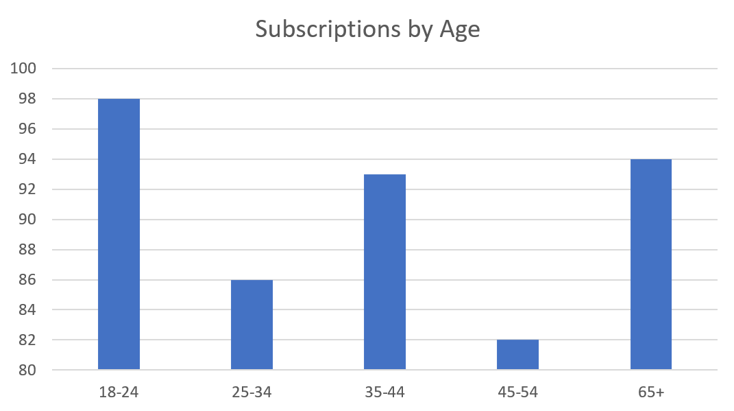
In the chart below, it appears subscriptions from customers between 45-54 years of age are much less than that of 18-24-year-old customers. However, in reality, there is only a difference of sixteen subscriptions.
Resolution:
Standardize axes, especially in recurring reports where an end user may want to compare multiple time periods. In almost all cases, bar and column charts should have an axis that starts at zero to avoid the “gap illusion” caused by small scales.
2. The Dreaded Pie Chart
I personally choose to use pie charts sparingly for a myriad of reasons. However, the two biggest downfalls of pie charts are:
- They often don’t show absolute values, but rather the contribution or percent of a total
- They are incredibly difficult to compare
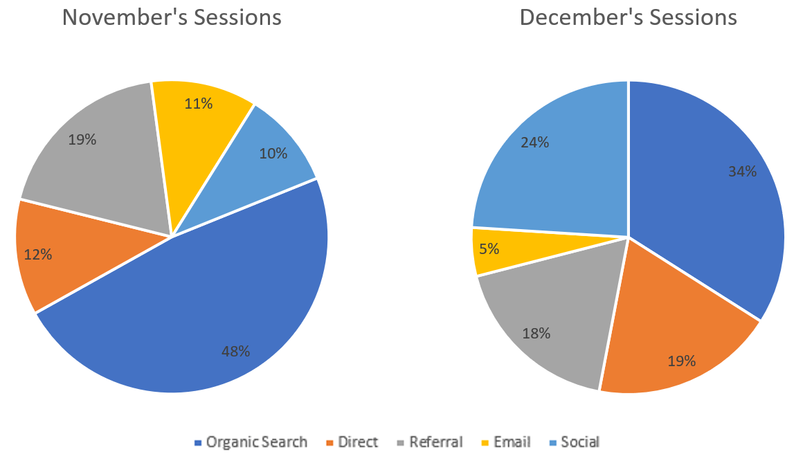
In the visualization above, there’s a few questions left unanswered.
For instance, were there fewer sessions from organic search in December, or did other traffic sources just make up a larger percentage of overall sessions? Perhaps there was a holiday sale that saw a massive increase in social traffic, which reduced the contribution of organic search.
In this case, your audience might think organic traffic decreased -14%. However, if the absolute number of sessions were shared, they’d find organic search sessions increased 9%.
Pie charts tend to be misleading when performing standard comparisons such as month over month or year over year.
Resolution:
Use pie charts sparingly. If you must use a pie chart, be sure to provide insights around the absolute values you are measuring, especially when comparing data.
3. Relying Too Much on Color
It’s 2019, so for the most part, getting a color printer isn’t a big deal. However, there’s a good chance you’ve received an email from your office administrator asking you to print in black and white unless mission-critical.
Hence my next point: stop relying on color to tell the story of your data! Beyond catering to users that are asked to print in black and white, about 1 in 12 males and 1 in 200 females experience color-blindness.
If you can’t interpret your chart without color, there’s a good chance your data may not be interpreted correctly, if at all. And if I didn’t get my point across before, pie charts are a major offender of relying on color to get the point across.
Resolution:
Use color to make your visualizations more appealing, and perhaps bring focus to a specific piece of information, but don’t make the interpretation of your chart contingent on someone’s ability to see color.
4. Picking Aesthetic over Function
Don’t get me wrong… there are some very aesthetically pleasing data visualizations that do serve their purpose. In fact, you can find some great examples on the Reddit thread called “Data is Beautiful” and Makeover Monday. However, it’s also easy to, as they say, lose sight of the forest for the trees. Analysts can become so focused on making a beautiful visualization that the end user cannot easily interpret it, and it’s simply that – a “pretty picture”.
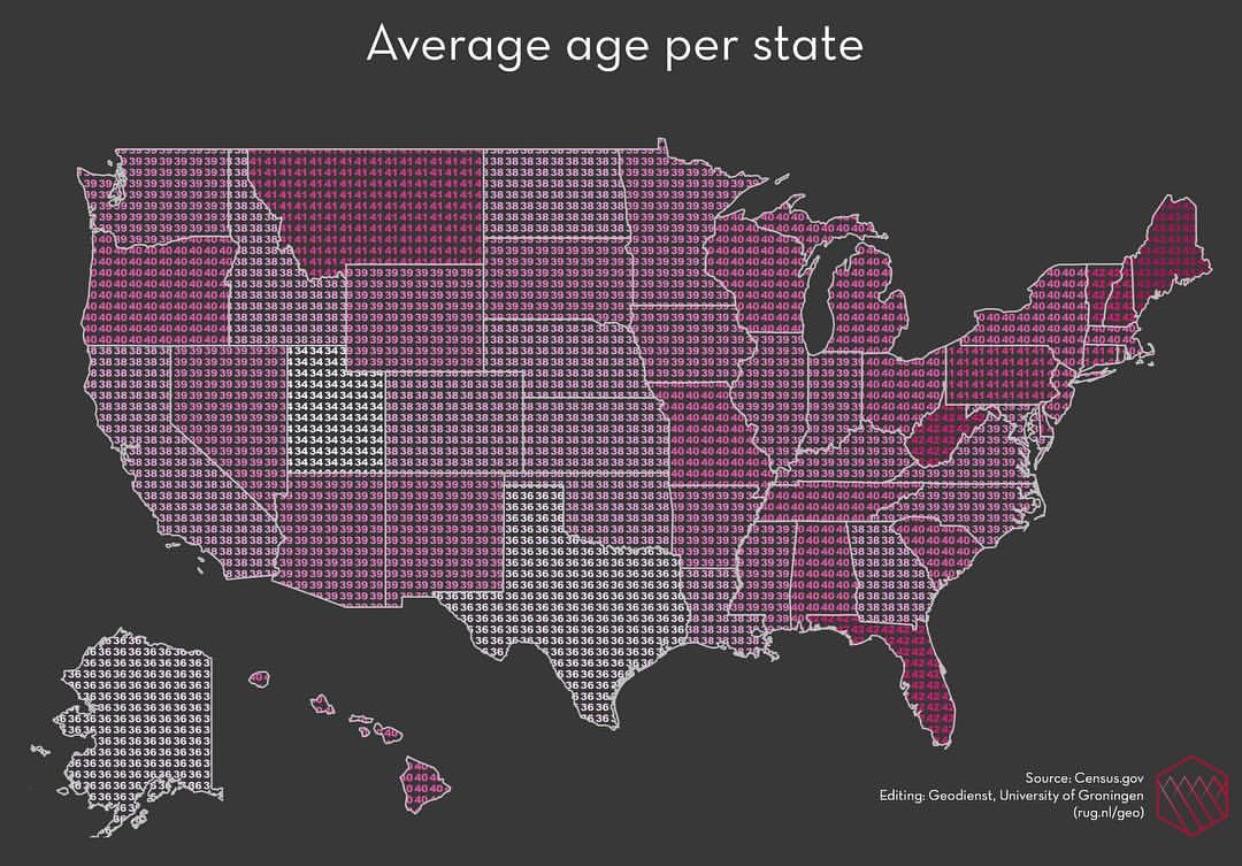
Take for example this visualization (taken from the Reddit thread “Data Is Ugly”).
While this visualization may look pleasing, it’s very difficult to interpret. Intended to show the average age per state, it’s clearly not easy to see the metric associated with each state and comparing states with equal average age is very troubling due to the closeness of colors.
Resolution:
Your visualization should not require the audience to exert effort in order to properly interpret the data set. If you find yourself focusing more on how a visualization looks than the story it tells, step back and have a friend or coworker give their initial interpretation.
5. Difficult to Visualize Difference
If you remember from earlier, data visualization is intended to communicate patterns, trends and correlations. So, as you can imagine, if the visualization you’ve created makes it difficult to see obvious differences, there’s a good chance it doesn’t serve a worthy purpose.
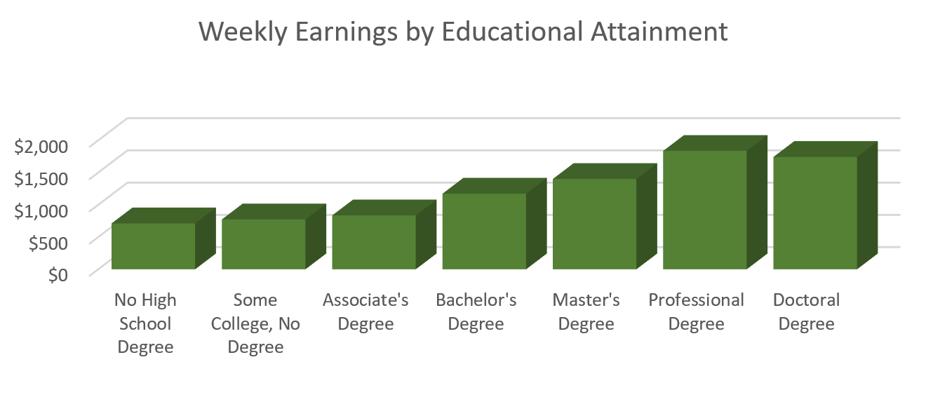
The visualization provided is a great example where the differences in weekly earnings by education attainment are fairly small in many cases. I used data from the Bureau of Labor Statistics to visualize the average weekly earnings of individuals with a professional degree versus a doctoral degree. It’s not easy to see that doctoral degree holders actually make $93 dollars less per week than professional degree holders. While $93 dollars may not seem like a large amount, that’s nearly $5,000 less per year. The lack of clear difference between an incremental increase in educational attainment make this visualization ineffective.
Resolution:
Labels surely can help provide additional context in situations where the differences among categories is difficult to visualize. Additionally, as mentioned above, adjusting your axis in a way that improves the scale of your data may help emphasize your point (but make sure they aren’t misleading, or we are starting from square one).
Data Visualization Resolutions for 2019
In conclusion, strive this year to improve your data visualizations by:
- Standardizing axes and using logical measurement scales
- Leveraging pie charts sparingly and strategically
- Avoiding the use of color as a crutch to improve your charts
- Designing with function at the top of your mind
- Ensuring differences in data are clear and straightforward
Still need help telling the story of your data through visualization? Let us know how we can help (and maybe even get you on the “Data is Beautiful” thread).