
Attempting to understand how a visitor uses your website by analyzing your web analytics platform alone could cause you to make inaccurate assumptions. Quantitative metrics like bounce rate, conversion rate, time on page, and page load time can help you begin to understand user experience, but when matched with a heatmap, you can truly see the full picture.
Let me introduce one of my favorite tools as a web analyst – heatmaps!
Heatmaps are a great experience optimization tool used to help "paint a picture” explaining how a user navigates and interacts with a website.
I like to think it’s how Bob Ross would explain website analytics if he was given the chance.
What are Heatmaps?
Website heatmaps are visual representations of how visitors navigate through your site, using warm and cool colors to show where visitors are engaging on the page. Essentially, you add a script in the code of your website which allows your heat-mapping tool to gather data in the background.
What you end up with is a visual representation of how users are engaging with a website, to supplement quantitative data that you can pull from your web analytics tool or marketing automation platform.
Not only is this extremely valuable information that you can’t always get from your typical analytics platform, but I find that our clients understand this visual representation more easily than using numbers alone.
A quick example:
Problem: You may notice your landing page is seeing plenty of traffic, but the goal of this page is to get users to click on a specific link, and they are not completing this action.
Insights from an analytics platform: You can learn how long users are spending on the page, see the exit rate, and identify what pages these users are navigating to.
Insights from a heatmap: You can learn that only 4% of users are scrolling down far enough to see the call to action (CTA) button.
Summary: While there’s plenty of traffic going to this page, they are not seeing the CTA, so they are unable to complete the desired action. Without a heatmap, it would be difficult to come to this assumption.
Analytics data is more black and white, while heatmaps are more - for lack of better words - a rainbow, and are open for interpretation. While both quantitative and qualitative data are powerful on their own, combined they can give you a more realistic idea of how your users are navigating the website.
Different Types of Heatmaps
Our clients typically use one of two data analysis tools for this - CrazyEgg or Hotjar. Both are excellent choices and we highly encourage our clients to use one of them, but they both have unique offerings and capabilities.
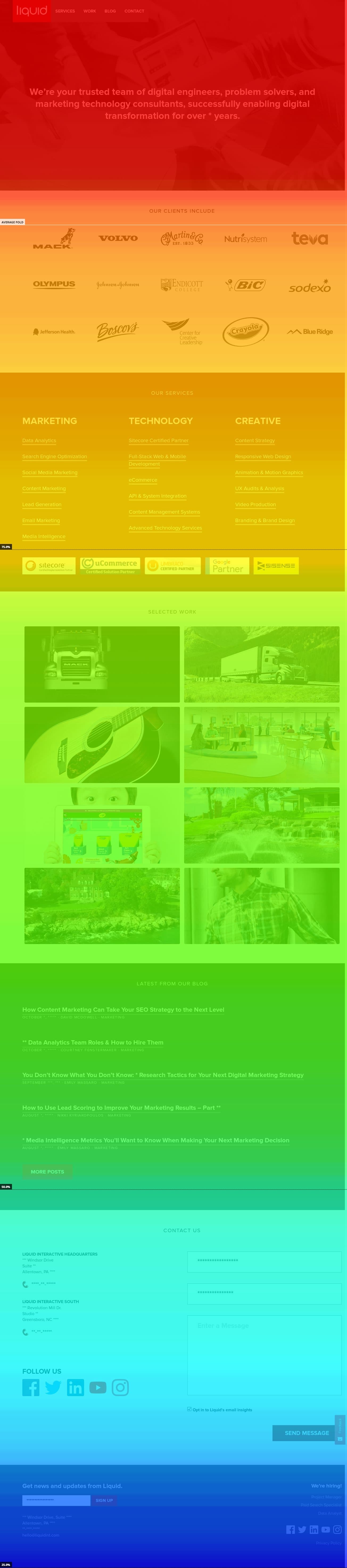
Scroll Map:
A scroll map is a visual explanation to show how far down users are scrolling on your web page. Each color represents a scroll percentage, with the warmer colors indicating more viewership (white, red, and yellow) and the green and blue representing where users are less likely to scroll. The black section indicates a very small percentage of visitors seeing the information.
The white line indicates the average fold for the page, showing what portion of the page is usually visible when someone views this page. Typically, you’ll see a loss in traffic around 25% at the fold, but if you’re seeing percentages higher than that, there could be a problem.
Click Map:
This click tracking map indicates where your visitors are clicking, using a similar color scheme as the scroll map to indicate which links or buttons receive the most clicks. The warmer the color, the more clicks. 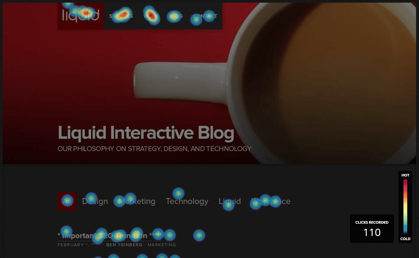
Confetti:
Crazy Egg has a more specific type of click map available that works great for sites with a large amount of traffic from multiple sources and campaigns. With a confetti map, you’re able to view click traffic from specific groups. Examples include Google’s campaign name, country, user type (new vs. returning), operating systems, or even separating clicks by time of day. This allows you to easily segment traffic to see how they are engaging with the site and where they end up clicking.
Note: This type of map is only available in Crazy Egg.
List Report:
The List Report displays all elements on the page that have received clicks, regardless of if they are a clickable element. This will display how many clicks they received and what percentage of page clicks that element makes up. This includes pictures, links, text, phone numbers and more.
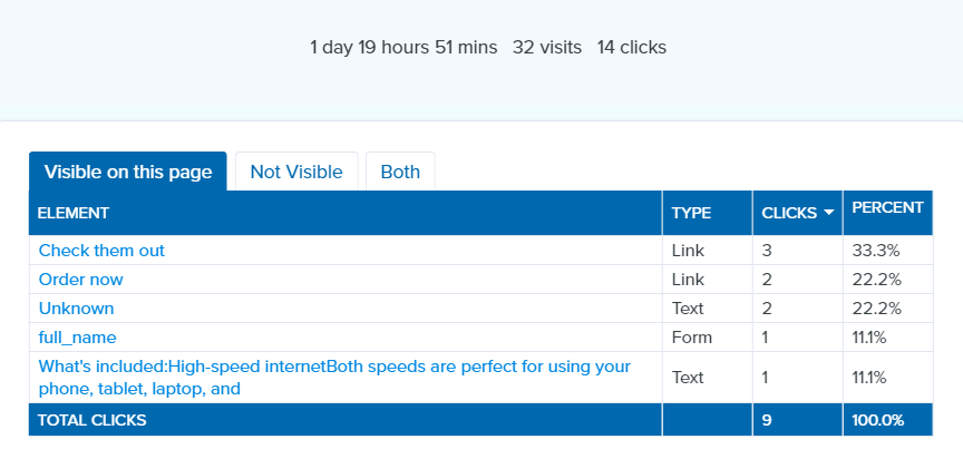
Note: This type of map is only available in Crazy Egg.
When should you use heatmaps?
For many companies, heatmaps are used solely as a post-website redesign strategy or to look at the performance of new landing pages. While both of these scenarios present a perfect time to use a heatmap, I believe this tool should be utilized much earlier in the timeline.
Adding a heatmap to your old site before a redesign allows you to leverage the insights from the old site and make changes based on data, not just assumptions. This includes:
- Understanding how website visitors are currently using the navigation bar
- Expanding on sections of the website where readers are pausing to digest information
- Adjusting important CTA and form placements based on scroll depth
- Identifying what sections of the website are underutilized and may not be necessary on the new site
Arm yourself with plenty of data before you make changes to any website so you can look back and see if a change affected you positively or negatively and if you should try a new strategy.
Other fun UX features:
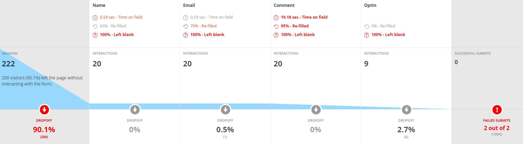
- Hotjar has a feature which allows you to look at users who dropped off while filling out a form; great for lead-gen sites.
- Both Crazy Egg and Hotjar have an ability to see recordings from actual website visitors, showing where their mouse moves, where they pause on a page, which pages they click to, and more
- Hotjar allows you to set up polls and surveys so your website visitors can give you feedback instantly
- Mobile and desktop visitors will use the site differently, so make sure you use this feature in both Crazy Egg and Hotjar to better understand device engagement
- Crazy Egg offers A/B testing within the platform, so you can build and test hypotheses with little to no support from a developer
Need help understanding the user experience on your website? Our analytics team is ready to dig through the numbers and visualizations to give you actionable steps to improve your UX. Let’s talk!